Anamorphosis
Space as illusion or reality

History and development
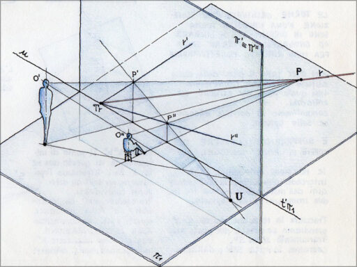
In art history, perspective represents the method capable of giving a restitution of the third dimension. Through this technique it is possible to reproduce the exact dimensions and shapes and the relative spatial location of an object. Anamorphosis reverses these principles. From the Greek ἀναμόρϕωσις = ana + morfosis, or compound form, it consists of a type of deformation proper to images, architectures and objects, for which the appearance of the same changes according to the observer’s point of view. In this case, it is necessary that the observation point is inclined with respect to the plane so as to allow correct viewing of the image.
Anamorphosis was originally considered a geometric method unknown to most and for this reason it was seen as a magical doctrine, an incomprehensible matter practiced by sorcerers and enchanters. However, it aroused the interest of most of those who learned about it. For this reason, over the years, numerous studies were undertaken to deepen this particular technique of inversion of perspective rules. We began to deepen the world of representation and to understand the contradiction between real space and its visual restitution. The awareness that the reproduction of reality was strongly conditioned by the mind and rationality of the person who elaborated it. The first historical notes written on anamorphosis are found in Leonardo’s Atlantic Codex, in which, through the distorted portrait of a child, the ability of this “alternative” technique to arouse amazement in the observer is explained thanks to its bizarre effects.
However, the “golden” era of this phenomenon occurred with the 16th and 17th centuries, when the first scientific studies on the topic were developed. In fact, in the period that includes the Renaissance and the Baroque, there is growing interest for the reverse perspective and for the anamorphism. In art, the first example of anamorphosis can be found in the painting “The Ambassadors” dating back to 1533, by the German painter Hans Holbein. In the lower part it is possible to observe a strange elongated object similar to a cuttlefish bone. The understanding of the painting in which a skull is actually represented can only be obtained if you place yourself at the bottom right of the painting. It is from this moment that the concept of sudden discovery, of amazement that leads to the authentic essence of the things represented and observed, makes its way. It is a process that guides the understanding of space as a basis on which to build and reproduce reality. Deformation is thus studied as a potential discovery of the hidden form and means by which to distinguish the sensitive space from the real one.
Optical illusion tricks
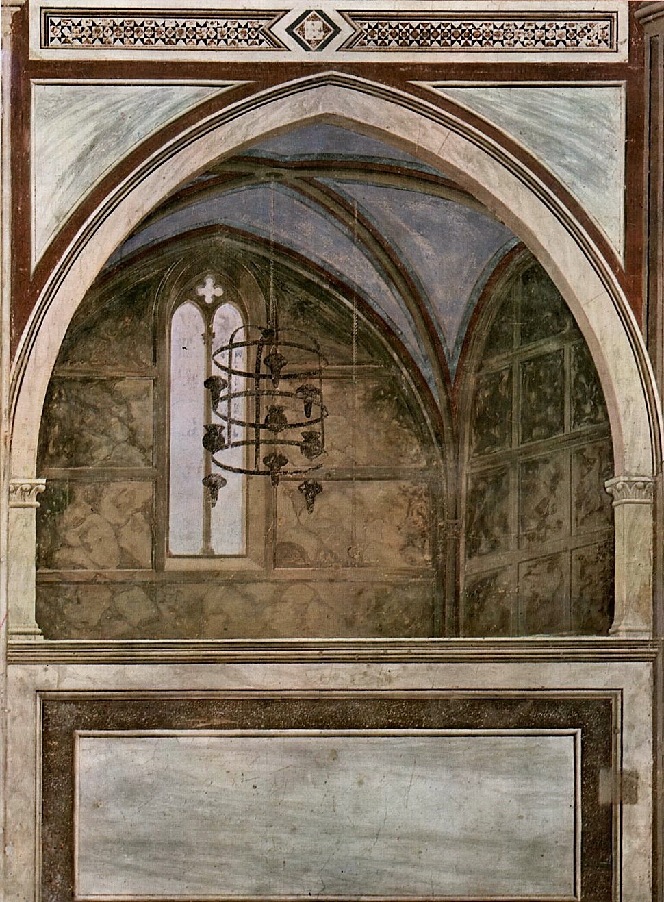
Since ancient times, the desire to represent reality as punctually as possible was manifested. Examples are the frescoes on the walls of the first prehistoric settlements, the stylized reproductions inside the tombs and temples of ancient Egypt and to follow the pictorial works of the peoples of the Mediterranean who were the first to experiment with the technique of the “illusionistic background” . Over the centuries, the development of architecture and its founding elements led to a greater awareness of change and the desire to reproduce the construction details of increasingly complex artefacts. The idea that spreads is to recreate the element in a faithful way to the real one to the point that the observer is deceived about the actual concreteness of the same. One of the most successful techniques in this aim is represented by trompe l’oeil. It is a pictorial genre that spread from the seventeenth century and, as can be deduced from the name “deceives the eye”, is aimed at creating effects of optical illusion. In fact, in the internal environments of residences and buildings, scenes were reproduced inside fake windows and frames, painted with great skill and with a realistic look. The dual purpose was to make the spaces wider thanks to the use of perspective and to give three-dimensionality to what was not really, through the play of chiaroscuro. This is how the material limits of the architectural elements are overcome and illusory spaces are created that can confuse the real dimension with that simply represented on the observer’s plane.
But the sixteenth and seventeenth centuries were characterized by other experiments in the perspective field which originated the alternative techniques of accelerated, slowed perspective and anamorphosis. These methods differ from each other because while the first two alter the natural order without denying it, the third annihilates it in favor of its own rules. It is a completely new approach according to which uniformity is obtained by deformity and stability by imbalance. It is in this period that, through these stratagems, it is possible to deceive the eye of the observer who, being in the same environment, can have a different and opposite return. Spaces made deeper thanks to the use of very convergent side walls and a raised horizon line or on the contrary rooms that appear less deep, due to the use of diverging side walls. It is respectively the application of the accelerated and slowed perspective. The third technique we are going to talk about is represented by anamorphosis which totally differs from perspective art. According to the latter, the observer had to be on a parallel plane with respect to the representation, so that the view would have been perfectly perpendicular to the object in question.
Furthermore, the position should not have been too close to the vanishing point. Contrary to what has been said, the anamorphosis requires that the observer places himself in a lateral position with respect to the object under examination and very close to the vanishing point, so that the visual ray assumes an oblique conformation. According to this procedure, the object appears distorted if observed in a frontal position but correct and recognizable if observed in an oblique position with respect to the plane. It is therefore immediate to understand how this period was characterized by a real revolution of the perspective laws in favor of new and bizarre representative methodologies.
Types of anamorphosis
As mentioned, the fascinating anamorphic method allows to discover with surprise objects that were not initially decoded, observing the distorted image. This particular geometric construction technique can be achieved through the projection criterion that provides for specific vanishing and observation points or through the reflection of the distorted image along a circular sector. In the latter case, the medium that can be used is represented by the cylinder (cylindrical anamorphosis) and the cone (conical anamorphosis). In the cylindrical anamorphosis, the shapeless image makes sense if it is “mirrored” on the wall of the reflective cylinder. However, it is a simple optical effect based on the laws of reflection, capable of deceiving the observer who perceives the correct image according to his own visual perception. This type of anamorphosis provides only one point of view and depending on the height, the position of the observer and the properties of the cylinder, a more or less altered image return is obtained. Instead, as regards the conical anamorphosis, as you can guess, it has a similar operation to the cylindrical one but the difference lies in the reflective body here constituted by the cone. In this case, the deformed image assumes its correct shape if the observer places himself at a precise distance in correspondence with the vertical of the cone.

Foto: http://www.incredibilia.it/opere-arte-anamorfiche – Fonte: http://www.enea.it
Anamorphosis and architecture
Often we have heard of anamorphosis used exclusively in the typical two-dimensionality of paintings and frescoes. However, it is interesting to deepen the theme applied to three-dimensionality and architecture. In fact, this method allows you to vary the sensitive perception of the environments, returning spaces with different dimensions to the observer. Some architectural examples that have developed throughout history help to better understand this mysterious and at the same time interesting phenomenon
EXAMPLES OF ACCELERATED PERSPECTIVE
Santa Maria presso San Satiro – Milan
The first architectural example that uses the accelerated perspective to return the illusion of a space deeper than the real one dates back to 1482.
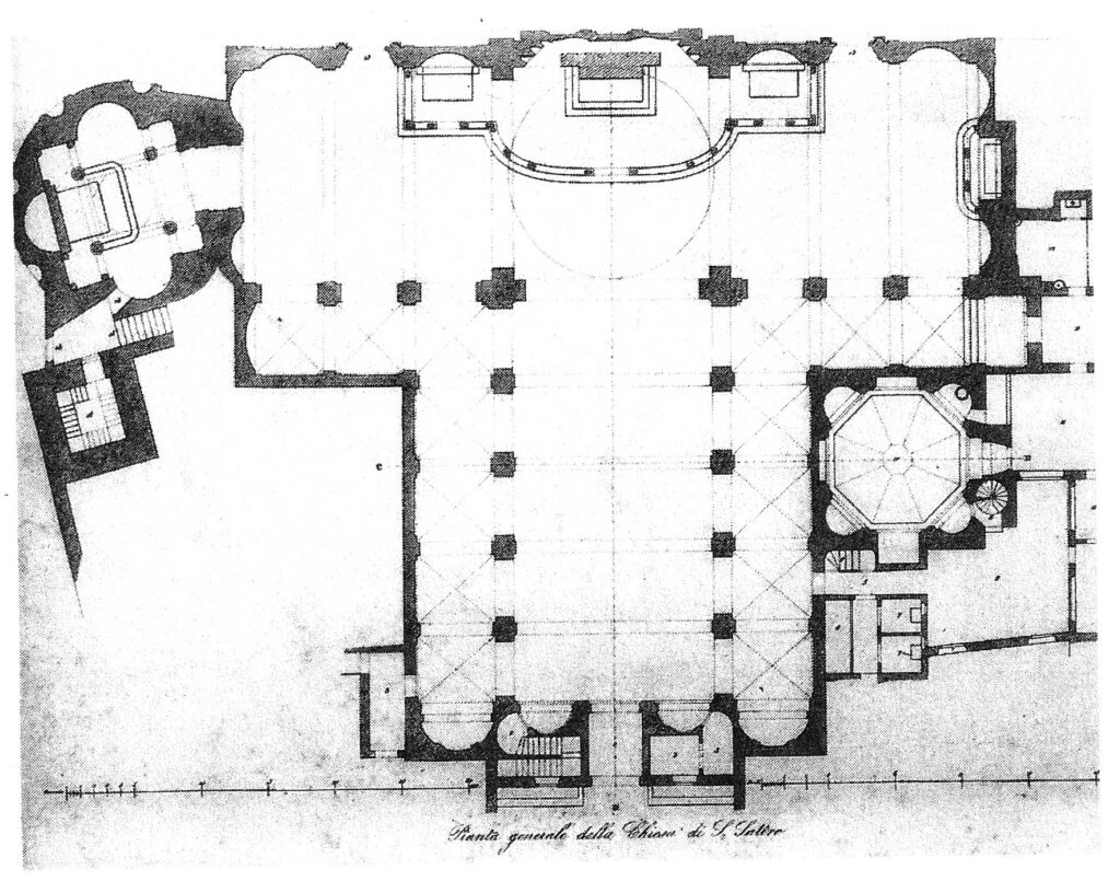
This is the Church of Santa Maria presso San Satiro in Milan, where, with great skill, Donato Bramante intervenes in order to remedy spatial problems. In fact, the church with a commissed cross plan was without a choir due to the road shape that prevented its construction between the nave and the transept. Using a refined perspective game, Bramante recreates a very convergent and 90 cm deep chorus that gives the impression of being in a deeper environment than it is in reality.
The reproduction of the rich barrel vault with drawers and the stuccoed columns returns the majestic image of a real apse. When entering the Church, the visitor does not notice the deceptive game of perspective that the artist has used and thanks to which he has achieved the goal of making the scene very realistic.
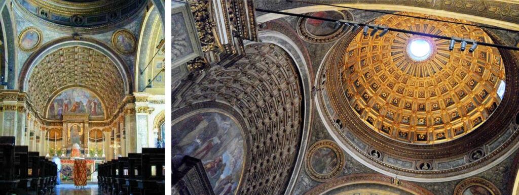
Source: http://maricarte.blogspot.com/2014/11/bramante-e-la-prospettiva-ovvero-la.html
Olympic Theater – Vicenza
During the 1500s, the theatrical scene was affected by this type of illusory solution obtained by glimpsing the side walls and also by raising the horizon. Progressively, the concept develops that reality and fiction merge in a perfect union.

And it is precisely in this climate that between 1580 and 1585, Palladio first and then his pupil Vicenzo Scamozzi, gave life to the masterpiece of the Olympic Theater of Vicenza.
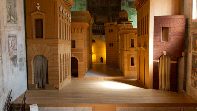
Referring to the ancient Roman theaters, Palladio creates a stepped cavea with a trabeated colonnade and faced by a fixed rectangular scene that defines the space intended for the actors.
The cosidétta Scenae Frons is characterized by a double architectural order, statues and three openings from which five streets branch out characterized by a strong accelerated perspective that makes them deeper than they really are.
All the architectural elements and details are foreshortened and the illusory and real spaces are directly connected.
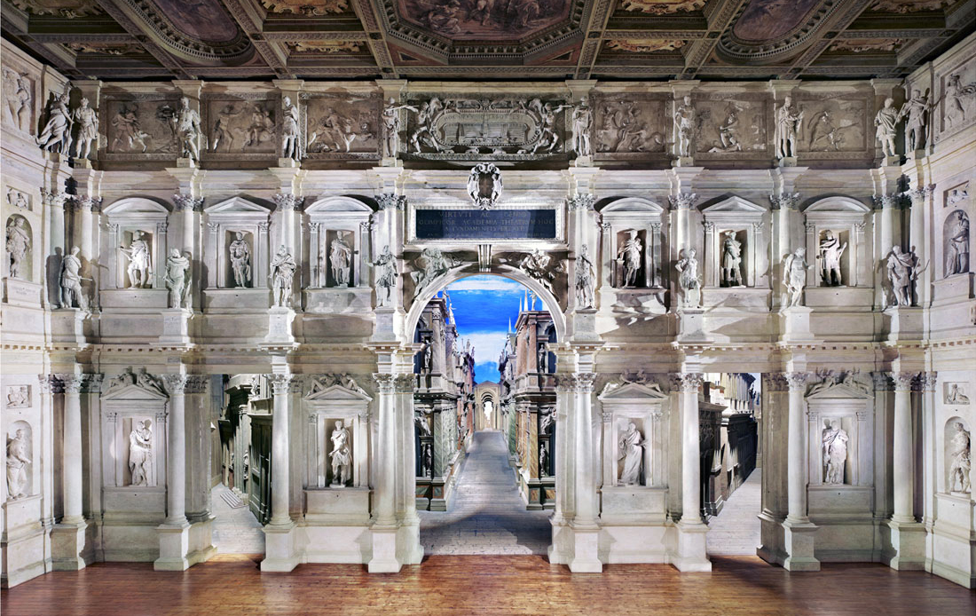
Photo: http://www.progetti.iisleviponti.it/Palazzo_Enciclopedico/html/palladio.html
Ancient theater – Sabbioneta (Mn)
Built in 1588 – 1590 by Vincenzo Scamozzi, commissioned by Vespasiano Gonzaga duke of Sabbioneta, the old-fashioned theater is the first example of its kind, built from scratch.
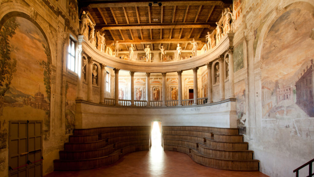
Thanks to the Palladian formation, there are many references to the Olympic Theater of Vicenza, first of all the elliptical colonnade dominated by statues that surrounds the mixed cavea.
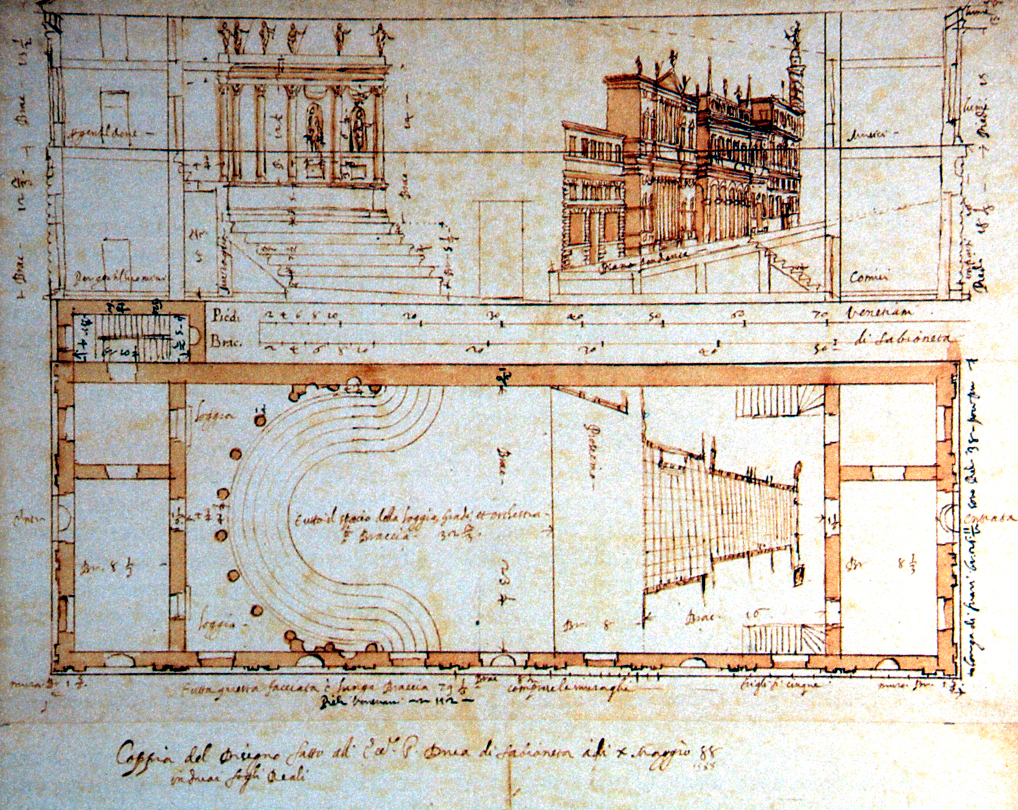
However, in this case, the Scenae Frons is absent in favor of the continuity between the hall and the stage.
The side walls are cooled with landscapes and fake architecture and together with the backdrop and backdrop, they follow the principles of accelerated perspective which returns the illusion of spaces of greater dimensions and depth.
Today’s stage composition is not the original one that was destroyed, but a 1996 reconstruction that represents an ideal glimpse of the city of Sabbioneta.
Furthermore, recently, the theater has undergone a non-invasive conservative restoration for the original structure and has been declared a UNESCO World Heritage Site.
Palazzo Spada Gallery – Rome
The 16th and 17th centuries are characterized by a continuous exchange between theater and real life and for this reason the solutions adopted for private buildings are often taken directly from the theater scene. In this regard, inspired by one of the streets that depart from the scene of the aforementioned Vicenza Olympic Theater, in 1638 ca. Francesco Borromini builds the gallery of Palazzo Spada in Rome. It is an example of an accelerated perspective where space appears to be quintupled in length despite only 8 meters of real depth. The convergence of the side walls and the floor (which is raised) with the lowered ceiling is accentuated. The front arch, which measures 6×3 meters, is progressively reduced to 2x1mt and reveals a surprisingly small statue at the bottom compared to the impression one has from afar. The size of the statue and of the subjects that travel through the gallery, of course, is the same but the perception is that of figures that change according to the distance they take from the observer. This is because the gallery was built in order to emphasize its depth and for this reason the walls, floor and ceiling are not regular at all.
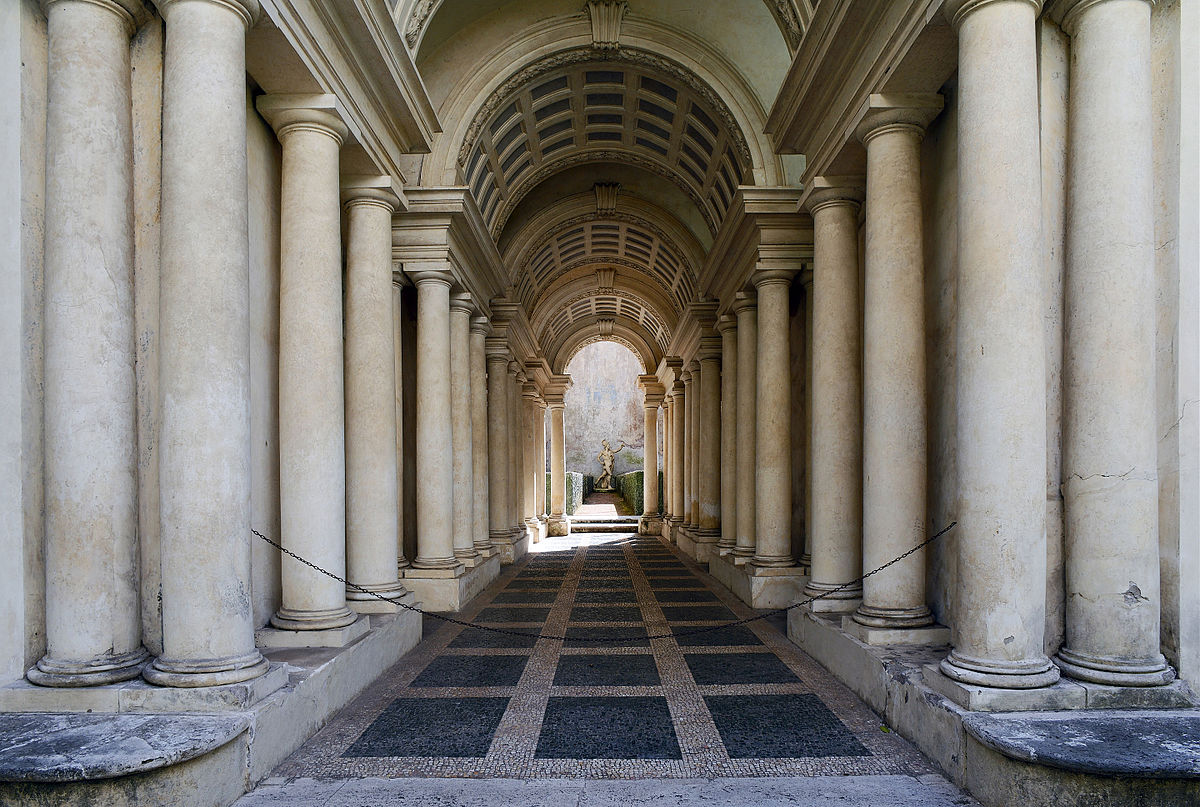
Front view of the entrance to the Construction Gallery

In the diagram on the right the room of Ames, a room with a shape distorted in such a way as to create an optical illusion of alteration of perspective.
The room is built in such a way that, seen from the front, it looks like a normal parallelepiped-shaped room, with two parallel vertical side walls, a back wall, and a ceiling and floor parallel to the horizon. In reality, the plan of the room has a trapezium shape, the walls are divergent, and the floor and ceiling are inclined. The inclinations and proportions in the size of the elements placed at the different depths are calculated taking into account the rules of perspective.
As a result of the illusion, a person standing in one corner of the room appears to be a giant, while another person standing in the opposite corner looks tiny. The effect is so realistic that a person who walks from corner to corner seems to get bigger or smaller. (Source Wikipedia)
Scala Regia – Vatican City
The restoration of the Scala Regia of the Apostolic Palace located in the Vatican dates back to 1633-1666, by Gian Lorenzo Bernini. It is a famous example of an accelerated perspective where, as in most cases, there is the need to give the illusion of a space of more generous dimensions than those available in reality. The solution adopted by Bernini provides some precautions that change the perception of this narrow and steep space, located between the Church and the Apostolic Palace. The walls that delimit the staircase are irregular and converging and are characterized by a barrel-vaulted colonnade that narrows as you climb the steps. These columns have no base and are placed directly on the floor in order to make the environment leaner and deeper. The height of the elements that make up the Scala Regia decreases slightly but it is an imperceptible stratagem if you look at it from the base. The final result is majestic and perfect for the Scala’s sacred function as an entrance to the Vatican.
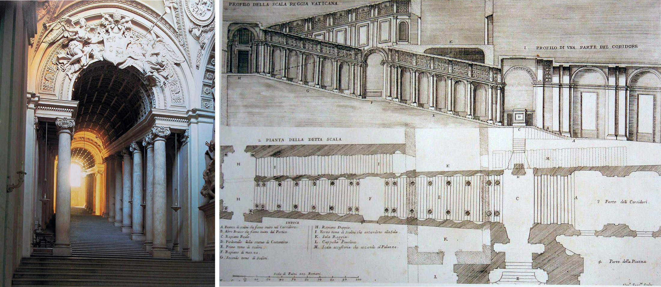
Photo: https://upload.wikimedia.org/wikipedia/commons/1/1e/Scala_Regia.jpg
Convent of the Sacred Heart – Rome
Located next to the Church of the Trinità dei Monti, the Convent of the Sacred Heart was completed in 1570 and the annexed refectory was frescoed in 1694 by Andrea Pozzo who used the accelerated perspective technique. The theme represented is that of the Wedding at Cana: on the perimeter walls fake architectures are reproduced that blend and blend perfectly with the real ones. The environment is transformed into a palace with numerous columns and rich perspective games. It is impossible to distinguish between real and frescoed capitals, everything appears in a harmonious and realistic continuum. The depth of the composition is accentuated by the light shades and the dynamism of the reproduced figures that seem to really protrude from the arches of the terrace where the wedding celebration takes place. It is also clear, how the Well uses the anamorphic technique as it is only by placing itself at a height of 1.60 meters that it will be possible to obtain a correct view of the composition, capturing all the perspective games present. But we do not find this type of stratagem only inside the refectory, in fact, in the upper galleries there are two paintings (one of which is only partially preserved) made according to the oblique anamorphosis. Depending on the position from which they are observed, both will reveal different themes, arousing great surprise for the observer. These are the San Francesco da Paola in prayer by Emmanuel Maignan (1642) and the San Giovanni Evangelista who writes the Apocalypse on the island of Patmos by Jean François Nicéron (1642), of which only a few fragments are visible.

EXAMPLES OF SLOWED PERSPECTIVE
Piazza Pio II – Pienza (SI)
In 1459 Bernardo Rossellino used the suggestive perspective games in his intervention in Piazza Pio II in Pienza. It is the only town square where the representative monuments of this small city are concentrated, transformed into such starting from the ancient village of Corsignano, at the behest of Pope Pius II. The square has a trapezoidal shape and its dimensions appear different according to the position from which it is observed. Thanks to the slowed perspective, in fact, it is possible to enjoy a double image of the square: if observed placing itself under the portico it appears wide and little extended in length, if you are at the entrance of the Church instead, it seems much deeper than it is in the reality. The geometric construction of the square provided for an organization in grids: horizontal for the flooring and vertical for the sides occupied by Palazzo Piccolomini, the Cathedral of the Assumption, the Palazzo Comunale and the Palazzo Vescovile. This is a meticulous intervention, designed to make the spaces seem wider and to widen the streets that surround the square and connect it to the rest of the city.

Right photo: Paolo Pannini from www.facebook.com/doctrinArchitecturae
Piazza del Campidoglio – Rome
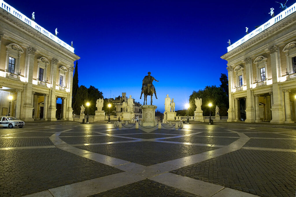
Piazza del Campidoglio in Rome is another famous example of anti perspective. Beginning in 1538, Michelangelo began his reorganization intervention giving rise to a trapezoidal-shaped square, conceived in order to make Palazzo Senatorio appear, in the background, wider and closer. The architectural pre-existence was preserved with its oblique trend which was continued by the new facades. The ultimate goal was to extend the perspective beam towards Palazzo Senatorio which constitutes the optical focus. The measures adopted for the success of the slowed perspective are the divergence of the volumes of the side buildings and the giant order of the Palazzo dei Conservatori, as well as the dilated architectural ornaments and the richness of the sculptural elements. Today the square represents one of the pulsing nuclei of Rome, the seat of the city government and a famous example of a Renaissance system, where the Palazzo Senatorio is mastered which can be accessed through the monumental double staircase, also by Michelangelo.
St. Peter’s Square – Vatican City
St. Peter’s Square is characterized by a particular spatial conformation: it is the fusion of two squares, one elliptical in shape and the other trapezoidal.
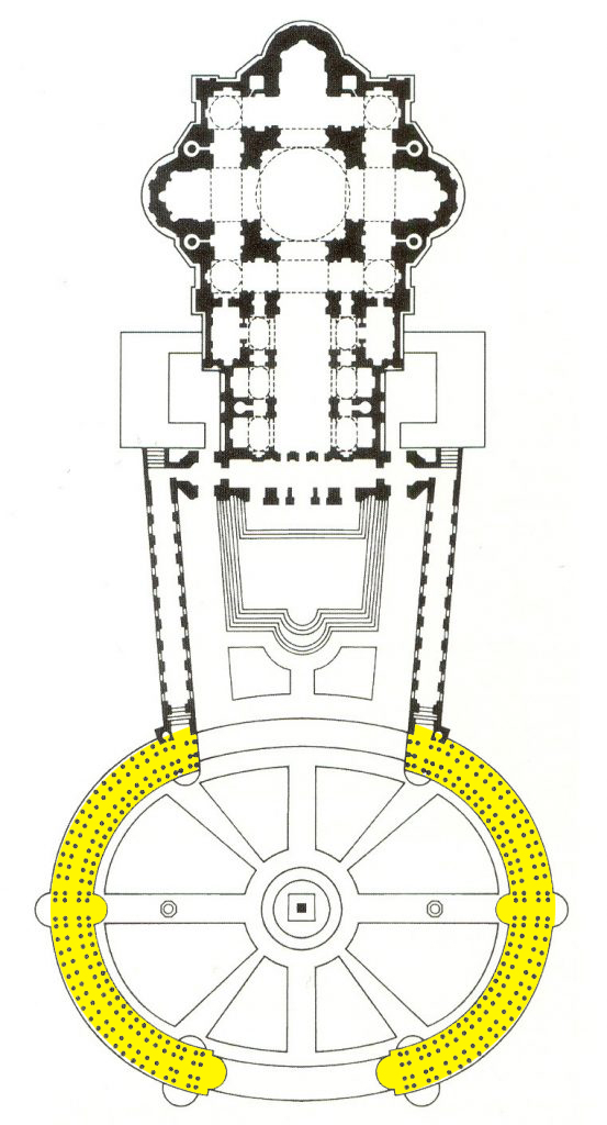
The trapeze-shaped section was created between 1655 and 1657 by Gian Lorenzo Bernini who uses the technique of anti perspective. The ultimate goal is to make the space seem smaller so that the observer is encouraged to remain in the front part in the shape of an ellipse from which it is possible to admire the dome of Michelangelo. The two sections are connected through four rows of architraved columns and surmounted by the statues of the saints. The square was designed with a curvilinear trend. With the aim of maintaining overall harmony by observing the complex, Bernini adopts the stratagem of progressively increasing the diameter of the columns with a consequent decrease in the distance between them. In this way the proportions between full and empty spaces are kept constant even in the rows of outermost columns. The result is a perfect alignment of the four series of pillars, so that only the innermost row is visible from the center of the square. As for the trapezoidal portion, this space is studied in order to return a facade of the church that is narrower and taller than reality. In fact, the side walls of this portion of the square are made up of pillars that lower as you arrive at the basilica.
St. Peter’s Square is an illustrious example of a monumental square that hides a strong symbolic meaning: a place ready to welcome the faithful in the elliptical square and to lead them to the basilica through the colonnaded “arms” of the trapezoidal section. Furthermore, the statues of the saints represent the link between the divine celestial sphere and the earthly world, symbolized by the volumetric mass of the pillars on which they are placed. What is evident is how once again architecture reveals itself as a mechanism between concrete and abstract reality, through prospective and compositional study.
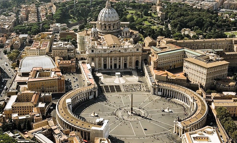


Between the cobblestones of the square there is a particular tile, placing itself at that precise point, the four rows of columns seem to converge in one.
If the architectures mentioned, are examples of the application of a well-perspective technique precise, it is possible to find some cases in which the perspective games used are manifold.
Church of Sant’Agnazio di Loyola – Rome
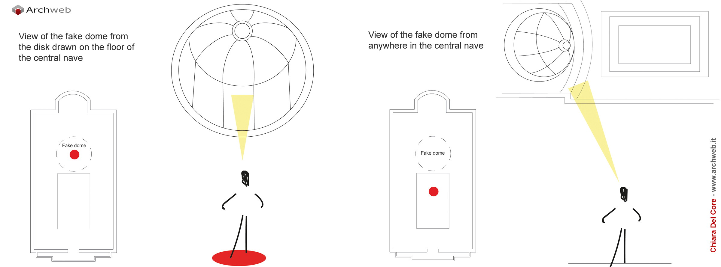
In the intimate setting of Piazza Sant’Ignazio in Rome, stands the homonymous church built in the first half of the seventeenth century. The construction works, commissioned to various architects of the time, began in 1626 and continued for several years. In 1685, with the work almost completed, the completion of the dome was missing and it was entrusted to Father Andrea Del Pozzo. Faced with a low economic budget, he found a solution capable of recreating a real circular dome, without implying heavy costs for the construction. Del Pozzo, master of perspective art in all its nuances, proposed an unrivaled stratagem. Entering the church, you notice how the choice of materials and floor decorations lead the customer to a specific point: the center of the nave. According to the “upwards” perspective technique, if you look up from this position, you can admire the fresco “Glory of Saint Ignatius” created with the perspective breakthrough technique.

This solution is able to double the space actually occupied by the painting, restoring the image of two overlapping architectures articulated in two orders. Proceeding towards the altar, on the floor there is a golden circle in which there is a second “strategic” point of view from which it is possible to observe a dome with a diameter of 13 meters. However, this is an optical illusion, in fact only from that precise position it is possible to observe the image of a real dome. Walking to the right or left with respect to the circle marked on the ground you will discover the real conformation of the ceiling: a flat surface that houses a deceptive perspective painting inside. Thanks to his refined skill, Father Dal Pozzo solved the problem of the absence of a real dome and endowed the church with a jewel of perspective art.
Anamorphosis: from decline to the present day
The anamorphosis technique finds full affirmation during the 1500s and 1600s thanks to the particular effect of magic and mystery able to recreate in those who observe the works affected by the same. In fact, the viewer feels amazement and surprise when he develops a new and different image from the one seen just before. However, this is a stratagem that hides innumerable studies and very complex construction practices. For this reason, in the years that open the following century, there is a progressive decline in the anamorphosis and the subsequent abandonment also due to the little interest in the spectacularization of art and architecture, in this period more related to formal elegance. It is only with the passing of several decades that this ancient technique is rediscovered, arousing the interest of many scholars and artists. Today the anamorphosis and the perspective games are exploited in the field of marketing and communication, in the artistic one of street art and in the study of perceptual psychology according to which the cultured reality is first filtered by the brain. Furthermore, with the spread of graphic digitization and specific software, it is possible to “streamline” the process of creating anamorphosis starting from simple images that are transformed in a short time.
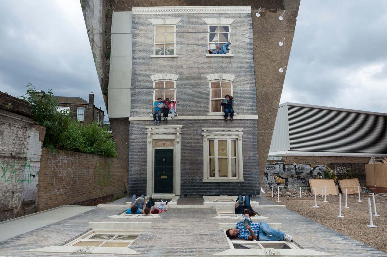
The current purpose of the perspective games used in art and architecture is the same as the original one: to create spatial optical illusions that can surprise the observer. To achieve this it is necessary to strike and give back strong sensations, to make possible what would seem impossible, even if only for a few minutes. There are numerous exponents of modern street art (Alex Chinneck, Kurt Wenner, Julian Beever) who reproduce painted architecture on a grand scale with refined skill. These are two-dimensional works but able to give the realistic effect of three-dimensionality and depth. Through the physical, material and sculptural perspective, what is not, becomes and the public is transposed for an instant into an illusory dimension. One famous example of this is Leandro Erlich’s Dalston House in Hackney, a singular work that has met with great approval among those who have seen it. The facade of a Victorian house was recreated here on the floor and a reflective surface above was inserted. The result is very suggestive: the visitor who is near the house reproduced on the decking seems to actively interact with its facade.
As for contemporary architecture and how perspective games are used in it, it is important to clarify some principles that underlie it. The concept of creativity is gradually spreading, which goes beyond the rigid form-function relationship in favor of symbolic and illusory solutions, aimed at giving the observer amazement and surprise. This is how the visual and emotional sphere finds its greatest affirmation and the architectural work reveals itself as an instrument through which common sense is called into question. Those who have always been considered the untouchable pillars of the architectural discipline are revised, the usual rules and practices are revisited to give space to original solutions thanks to which unexpected sensations are experienced.
In the 80’s of the twentieth century, studies on space were deepened, previously considered homogeneous and regular and now fragmented. There is a tendency to abandon the classic sense of harmony and grace, in favor of principles such as excess, ambiguous, immeasurable. It is a fantastic aesthetic aimed at stimulating surprising sensations very similar to those produced by past anamorphic creations. We are witnessing the progressive flourishing of studies on morphogenesis and on new and complex perspectives. The architectural work sometimes causes new feelings such as chaos and bewilderment in the observer. Also thanks to innovative techniques, the creation of architectural artefacts that undermine the consolidated geometric rules and deform the floors is facilitated. The difference from the past lies in the timing: while the application of the anamorphic technique once required studies and complicated construction processes, now through a few steps it is possible to transform the elements of the architectural project according to various perspective views.
To name just a few of the architects who resorted to this type of “subversive” principles, there are Zaha Hadid, Peter Eisenman and Daniel Libeskind, who worked through complex geometric processes very similar to those spread during the 16th and 17th centuries. Through distortion and deformation, the regularity of forms is again called into question and space is thus interpreted according to a new interpretation.
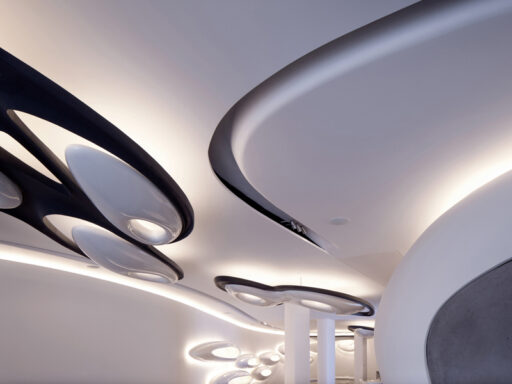
The new architectures generate the feeling of being in front of something unusual and unknown but which at the same time makes the unexpected possible. One example is the Vitra Fire Station in Will am Rhein dated 1990-93, which defines the rise of Zaha Hadid and represents one of the most famous achievements of the deconstructivist movement. The basis of the project is based on the principles of pure geometry and the complete absence of the ornament. What makes the work innovative is the deformation of the planes that are superimposed and placed in space, reversing the regular compositional order. The use of inclined and embedded surfaces prevails, each designed according to autonomous escape lines. The only material used is reinforced concrete which gives the composition an austere and pure appearance, enhancing the particular location of the elements and the relationship between them.
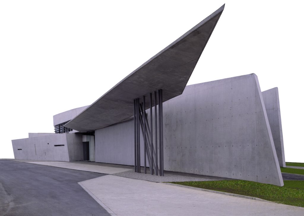
The canopy stands out sharply in the sky, while the three central slabs seem to fall at any moment due to their oblique course. These are basic geometric shapes that affirm their uniqueness and complexity in the spatial arrangement and can be observed from various points of view. What is certain is that the architect contributes here to giving a precise identity to the place, through the perceptual experience that is felt when visiting it.
As for the application of geometric principles and perspective games, considered on an urban scale, an example that should be remembered is Peter Eisenman in Robstockpark. Located in Frankfurt and built in 1992, it is conceived through a careful geometric reinterpretation, shaped on the shape of the place and the needs of the moment.
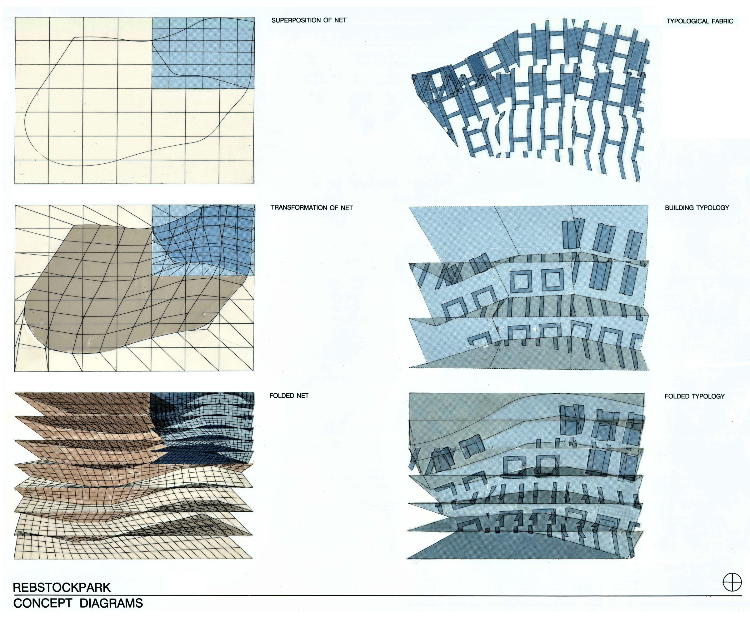
In fact, the project is carried out using the model of the perspective grid, modified and distorted here in order to obtain an innovative result. This solution can be compared to a real anamorphic stratagem, since only if observed from a particular point of view, the bias lines of the volumetric distribution will appear perpendicular. In this way, the observer is stimulated to analyze the relationship between the individual parts that make up the project, rather than the structure in its entirety. The element that defines the physical personality of the Rebstockpark is the fold. Thanks to this choice, the urban layout is modified and allows a reformulation of the spatial organization, arousing particular interest for its unconventional aspect.
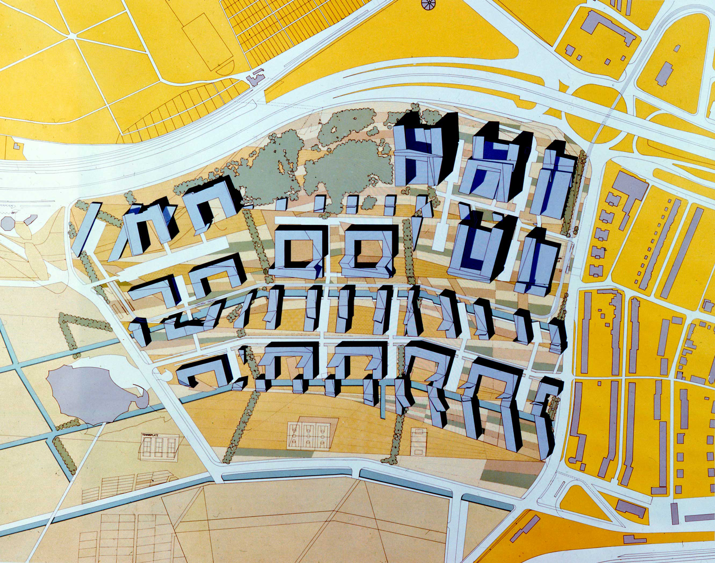
Photo: https://eisenmanarchitects.com/Rebstockpark-Masterplan-1992
Despite the audacious choice not to follow the classic principles of urban planning, the structure reveals cohesion and compositional fluidity thanks to the concept of “total and modified urban fabric”. The natural, built and residual elements open and distribute themselves according to order and continuity. This is how even in this example of careful urban planning, the classic rules are disrupted to make way for an apparently distorted but in reality functional and innovative alternative.
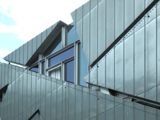
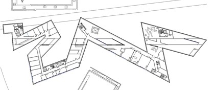
A third example of architecture in which perceptual illusion stratagems are adopted, is the Daniel Libeskind Jewish Museum completed in 1989 and located in Berlin. (see the project in dwg here)
The graphic designs reveal how the design concept manifests itself in a stratification of planes in which, since the point of view is not unique and defined, an initial misunderstanding is created. Here the relationship between building and hidden meaning is very strong: the architectural composition is shaped by the historical and celebratory reasons that underlie it.
Planimetry and interior of museum
Right photo: https://commons.wikimedia.org/wiki/File:Jewish_Museum_Berlin_02.JPG
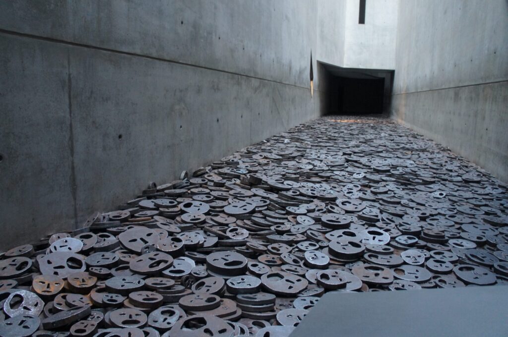
The Jewish Museum reproduces the shape of the star of David and is made up of decomposed geometries, interrupted spaces and cold and industrial materials. The two functional areas are distinguished through form and compositional choices: the exhibition space is characterized by a sinuous trend, crossed by a longitudinal line that cuts it recreating concave and inaccessible spaces, symbol of the void left by the Holocaust. In an adjacent position there is a hollow tower and a garden where some prismatic volumes that enclose trees inside them represent the concept of freedom denied. These meanings and messages contained in this work are revealed in the notes accompanying the drawings and writings transmitted by Libeskind, but not only. In fact, when you cross these spaces, the continuous paths convey the feeling of a slow but no escape route and the sudden transition from dark to light and from cold to heat recalls the uncertainty of human existence. Once again, architecture amazes and, as in the anamorphic process, reveals reality.
Unlike the Renaissance anamorphic processes, which in a more tangible way, through a distorted image or a false architecture, made the boundary between fiction and reality blurred, in contemporary architecture sometimes more “experiential” methods are used to reveal concrete purposes and messages.
