Open House is back in Turin
the houses and the interiors tell each other

Open House is back in Turin: houses and interiors tell their stories
Also this year Open House Torino has been a growing success: many residences and urban spaces have opened their doors to hundreds of curious visitors and lovers of design and architecture. The event embraced the entire city and also some extra-urban centers, without excluding the more peripheral areas. The aim, like every year, was to discover and re-discover areas that the collective imagination usually connects to a clear-cut identity which, thanks to the event, takes on unexpected facets. This is how industrial areas become areas dotted with contemporary lofts hidden in places previously used for production, the suburbs are rediscovered thanks to "residences – jewels" inserted inside apparently anonymous buildings and the center opens up in all the splendor of its historic buildings.
The program offered by the fifth edition was rich and varied. Below is a small selection of spaces that deserve to be discovered.
House for Three: the reinvented space
The first residence visited is noteworthy for its intense history and for every single detail, studied with attention and care. Located in a suburb of Turin, intended for mainly productive use, from the recovery of an industrial area, "House for Three" is born, a loft with a contemporary and refined flavor. To welcome us, on the bell, three names: Valeria, Fabio and Luca, the owners of the house, give and for which the same takes its name.The gray and impersonal courtyard was transformed by a mural of white clouds on a blue background, which allowed the space to become unique and recognizable and to give a new look to the relevance in the open air.
At the entrance to the house, what was once the staircase of the hallway of a small apartment, is now the internal staircase of the loft that guarantees access to the first floor. But it is not just a vertical connecting element, but rather a characterizing component of the house which, thanks to the numbers placed in ascending but intermittent order, has favored the learning of the owners' son from the earliest years of life, who in this way he learned to count.
An original and at the same time functional element that becomes an integral part of the life of those who live in the house.
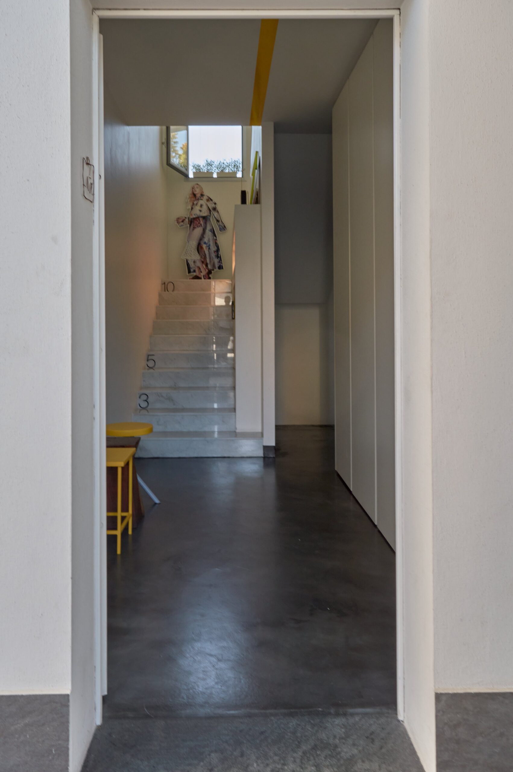
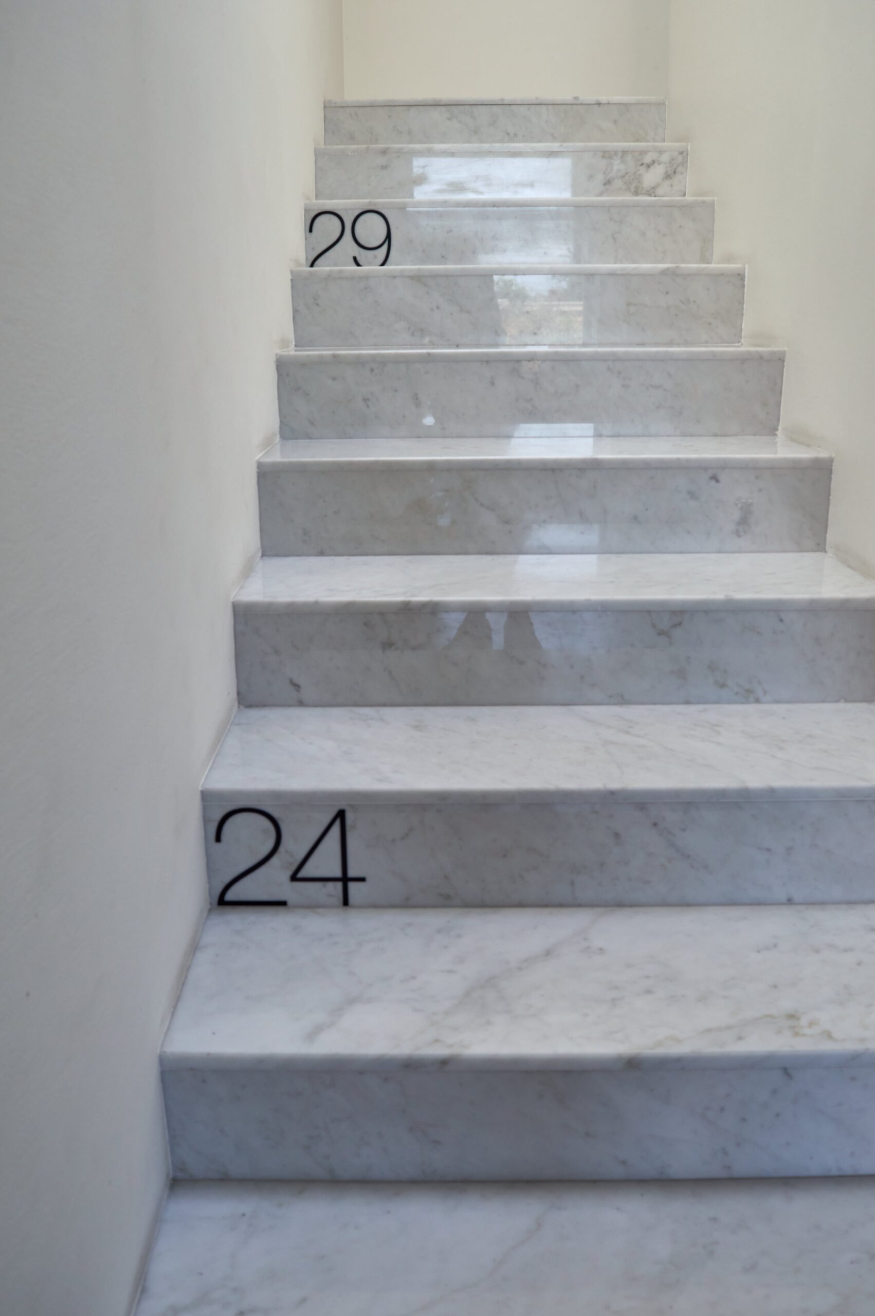
The scale with the numbers of House for Three, thanks to which Luca has learned to count
Images © Chiara Del Core
The entrance space is also characterized by a wall on which a frame has been applied that shows the graphic of the sky with the clouds already present on the external wall. In fact, the owner loved the idea of being able to change the appearance of the wall according to taste and needs and so she opted for an element designed ad hoc, tailor-made, just like you usually do with a setting.
The first floor of the building, built in part by filling a previous void above the staircase, houses a large open space featuring a conversation corner lit by a large bow window and a kitchen with central island. The plus value of the living area is represented by the large terrace where many potted aromatic plants have been inserted, a relaxation area and an area for eating meals with table and chairs.
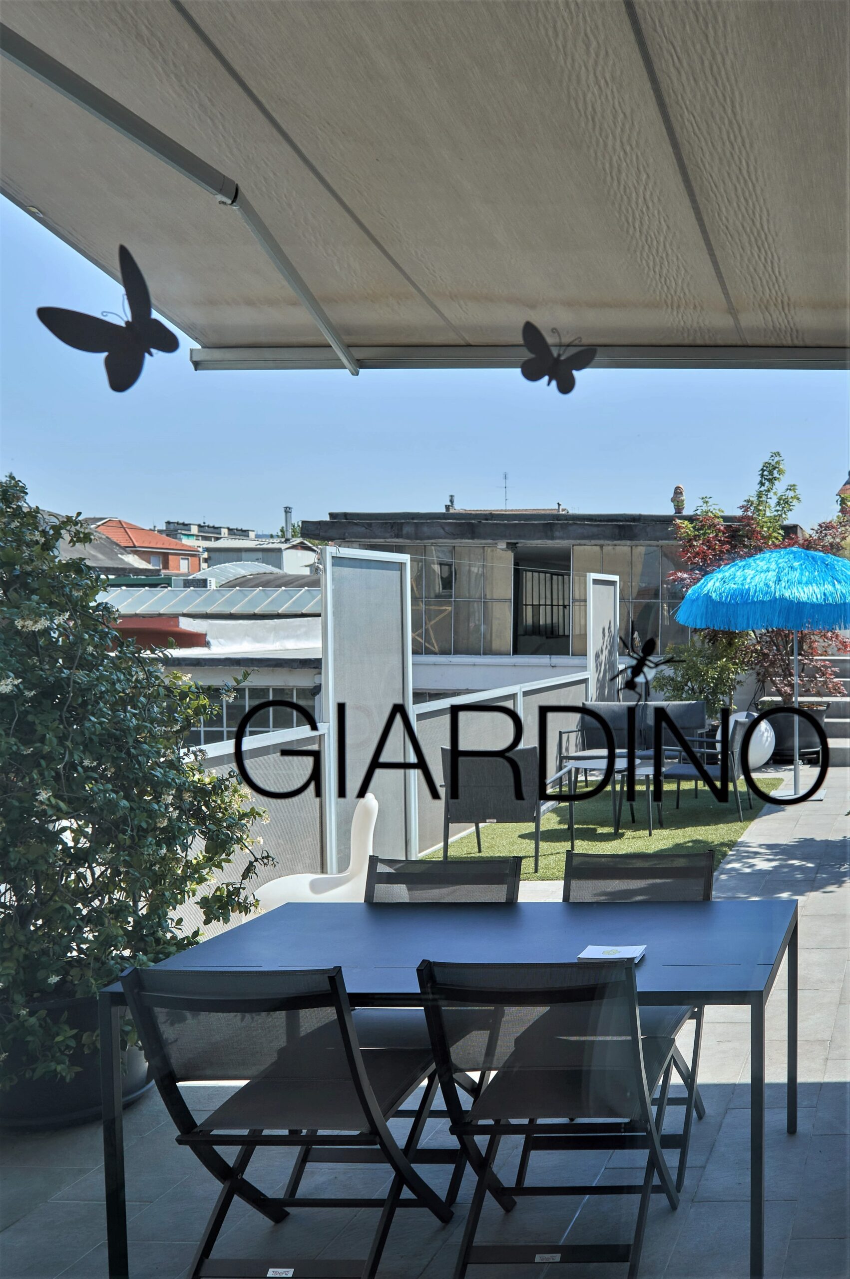
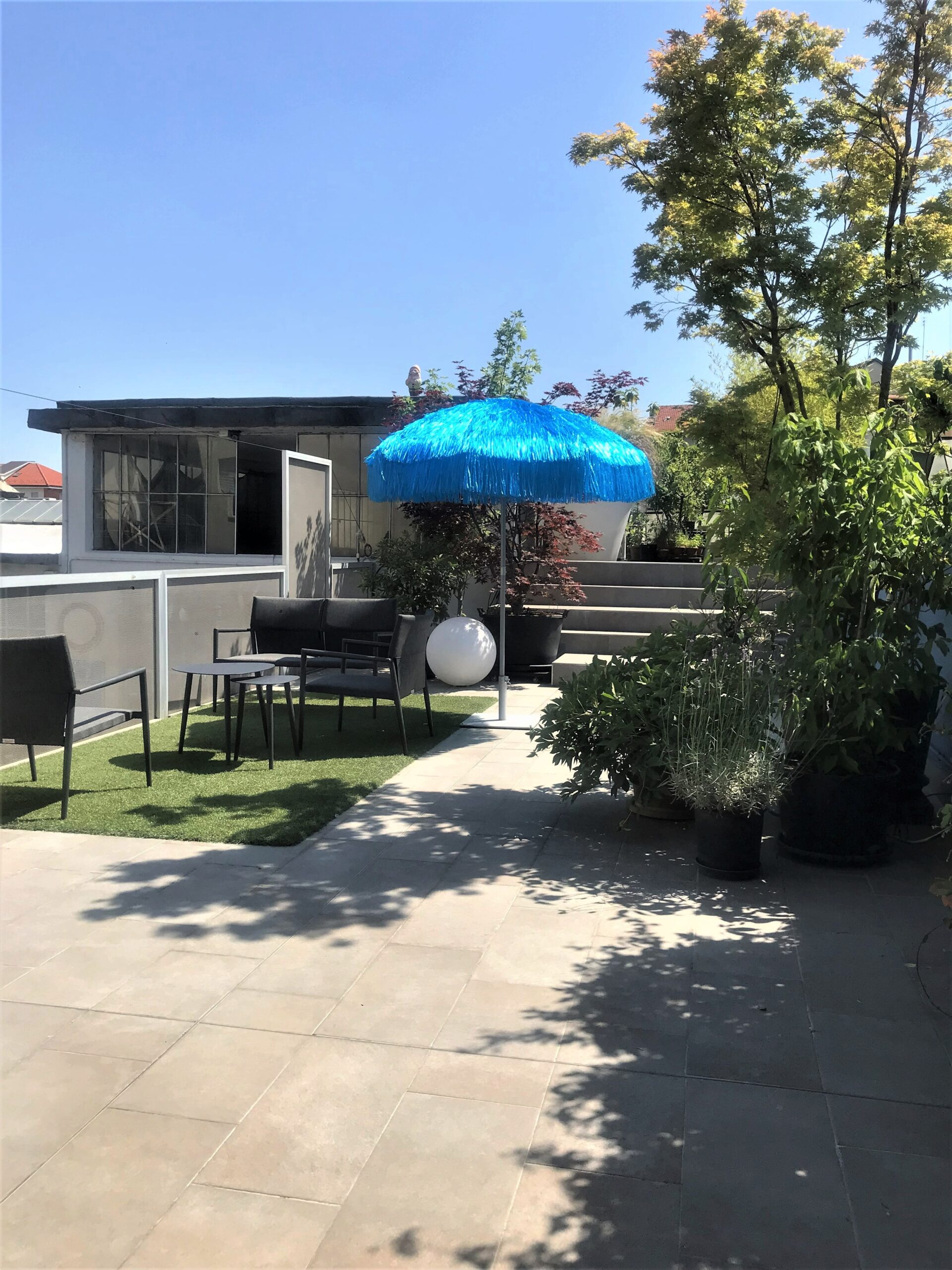
View from inside the sunny terrace
Images © Chiara Del Core
On the second floor there is the sleeping area with the two bedrooms and a study corner obtained from the wall of the staircase. A great deal of attention has been paid to detail in this environment as well: the folding door that divides the two bedrooms from the arrival landing is made up of extendable panels that show a family photograph in a large format.
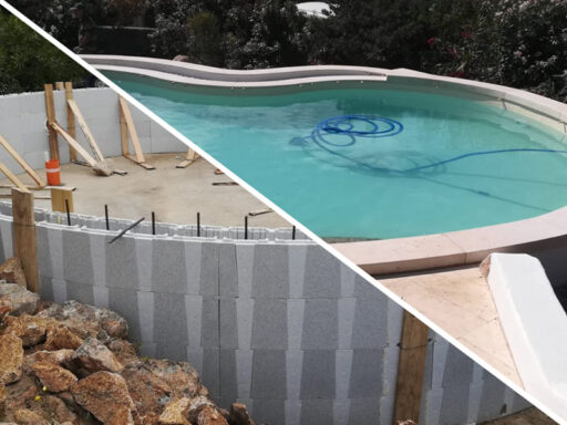
The entire loft is equipped with a radiant system placed at floor level and on the walls of the staircase once part of the unheated entrance hall. A particular sensitivity to sustainable choices has provided for the inclusion of a condensing boiler and the external thermal coat. Since the house is being transformed every year, an ambitious future project will be to add a swimming pool in the terraced area.
The owner is keen to clarify how they immediately believed in the potential of this place, according to "the idea that behind everything there is something else". In this way, coming from an uncrowded street, in a remote area of the city, you enter a house that becomes an oasis of peace, where the owners live in environments that fully reflect their ever-changing personalities and needs.
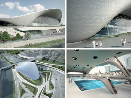
To browse a very original type of swimming pool click here
Squared: a residence between history and contemporaneity
In the historic district of the Quadrilateral Roman and precisely in via Delle Orfane, is Quadrato, a condominium resulting from a careful project of recovery and refurbishment of the ancient Convent of Sant’Agostino (16th century).Thanks to the historical characteristics of the area, the complex becomes a real continuum between past and present. In fact, in 2015, during the redevelopment of the block, some excavations were carried out that brought to light archaeological evidence dating back to the 2nd century AD. In the current internal condominium courtyard, three rooms belonging to a public building have surfaced. These are valuable rooms characterized by a mosaic floor: particular is the one that portrays the myth of Actaeon, now well preserved. In the following period the area will become a burial area for the Lombards, then a living area for ancient populations and finally, an area annexed to the Church of S. Agostino. It is therefore an urban lot that today represents a slice of life over the centuries.
To complete the internal courtyard where the small Roman-imperial archaeological park stands, we find the mural "Eaten by feelings" by the contemporary street artist PixelPancho and the football field on loan for use to the nearby oratory.
My visit continues to the top floor of the building, where you can admire a large loft that has been renovated and cared for down to the smallest detail. Particular are the openings that, like real frames of a painting, surround stupendous views of the city distinguished by the main Turin landmarks.
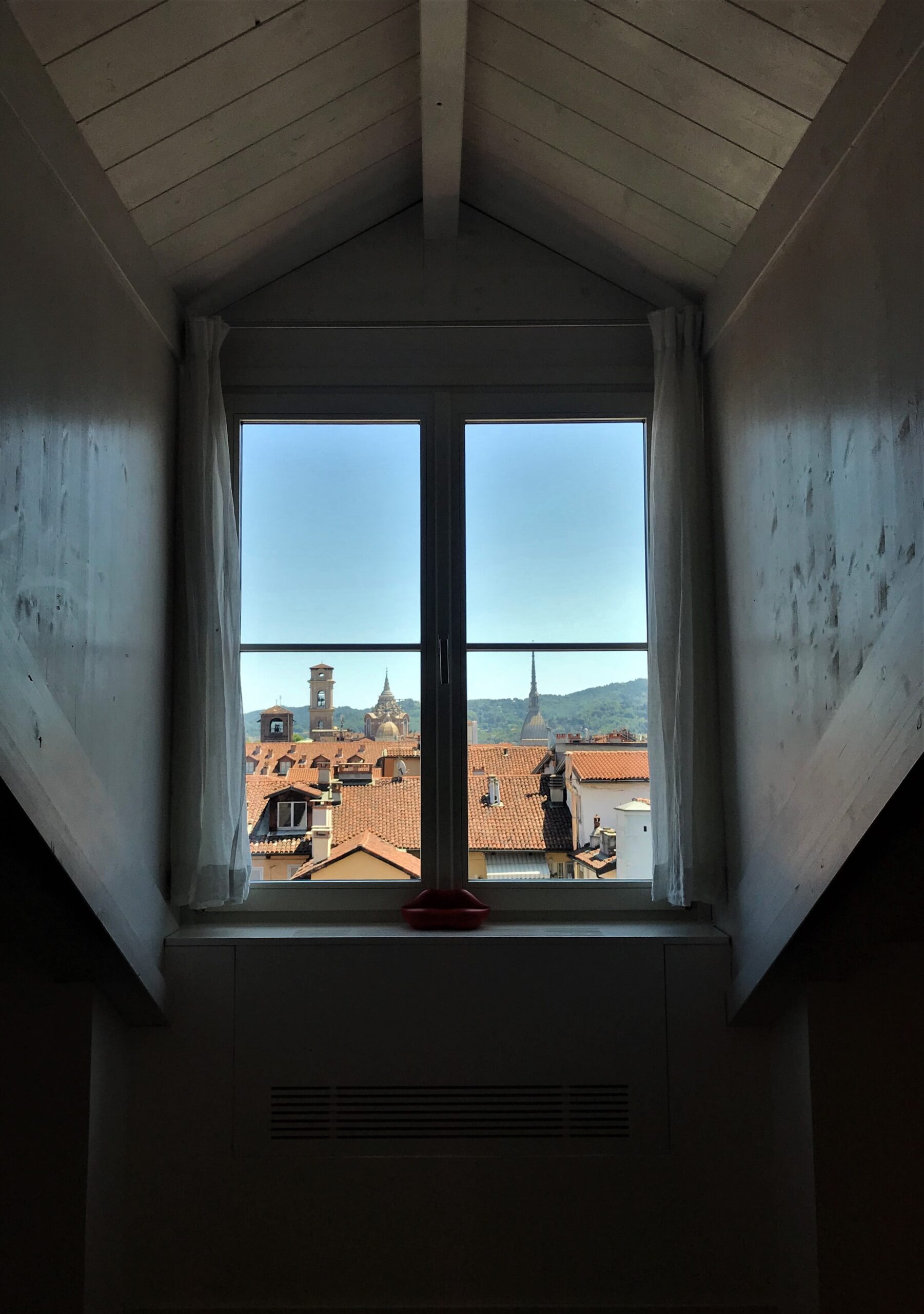
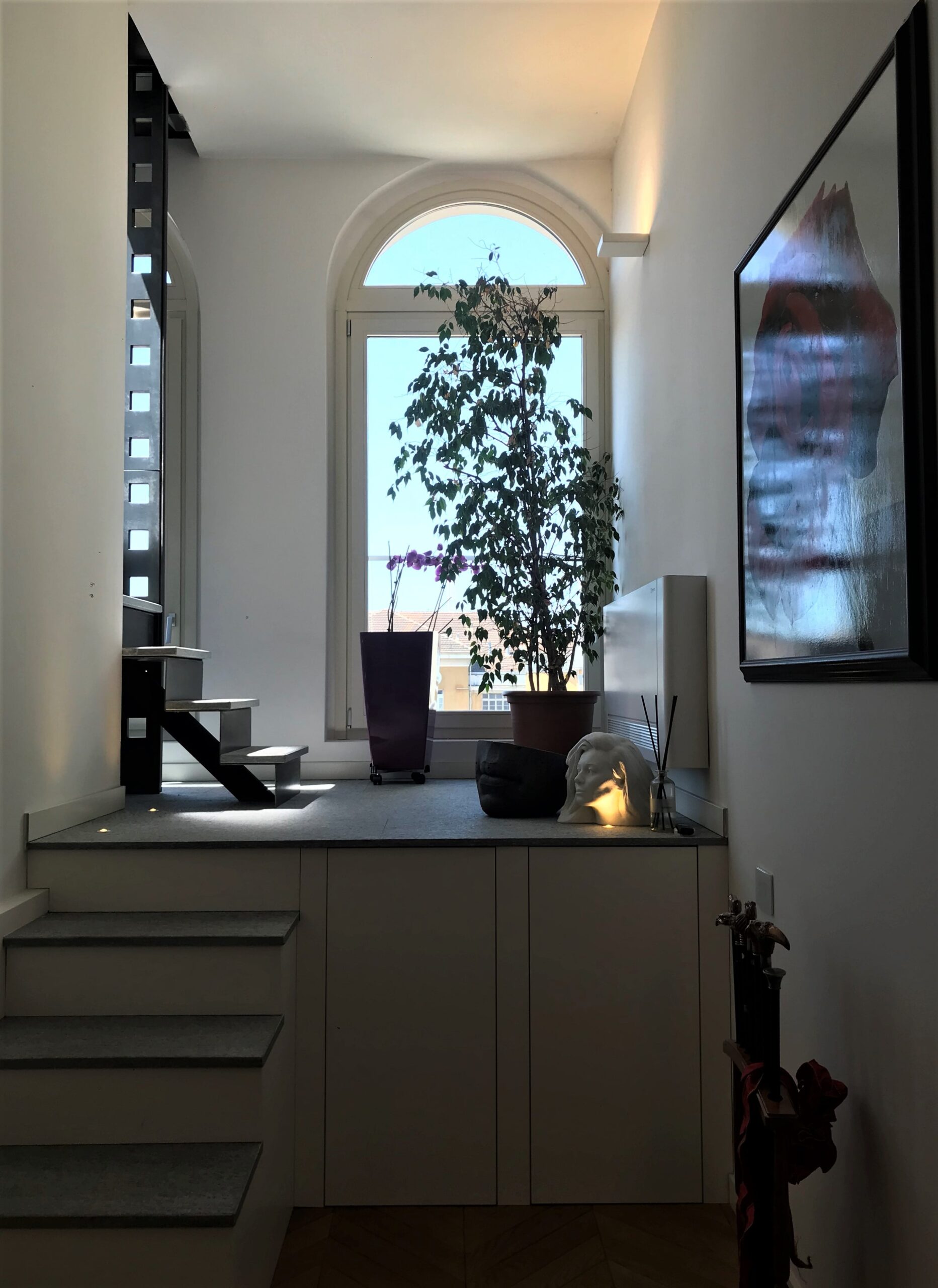
The windows become frames on the city
Images © Chiara Del Core
Going up a small internal staircase you reach the terrace of the loft which offers a priceless view over the roofs of Turin: roofs, domes, bell towers and monuments provide a priceless suggestion at high altitude.
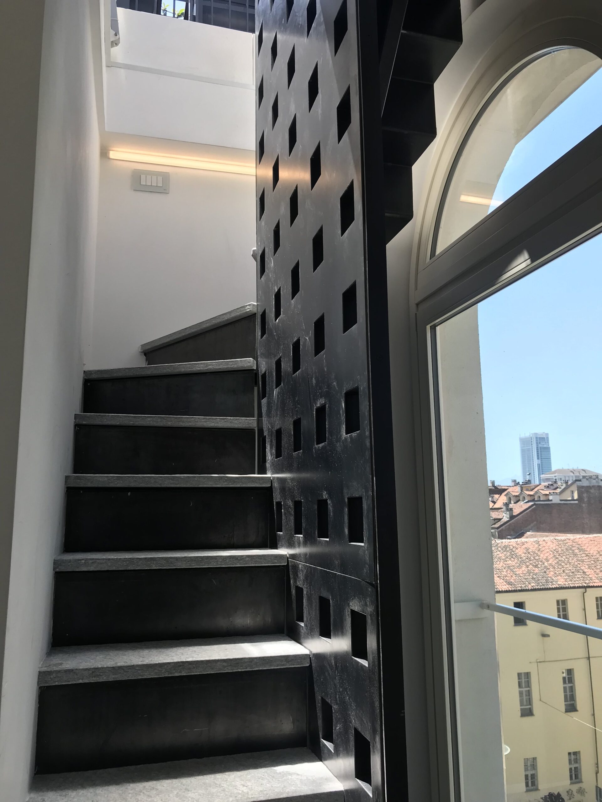
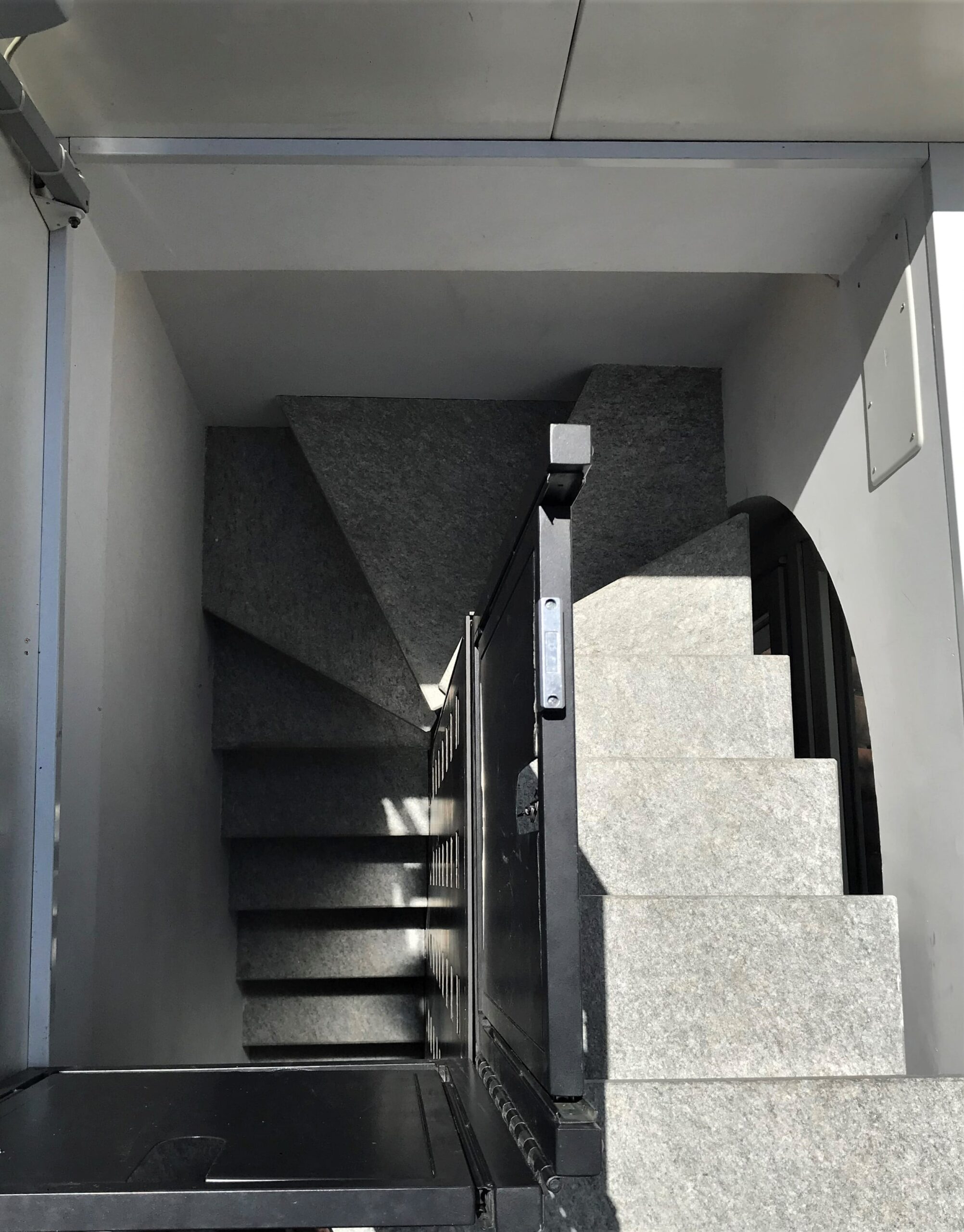
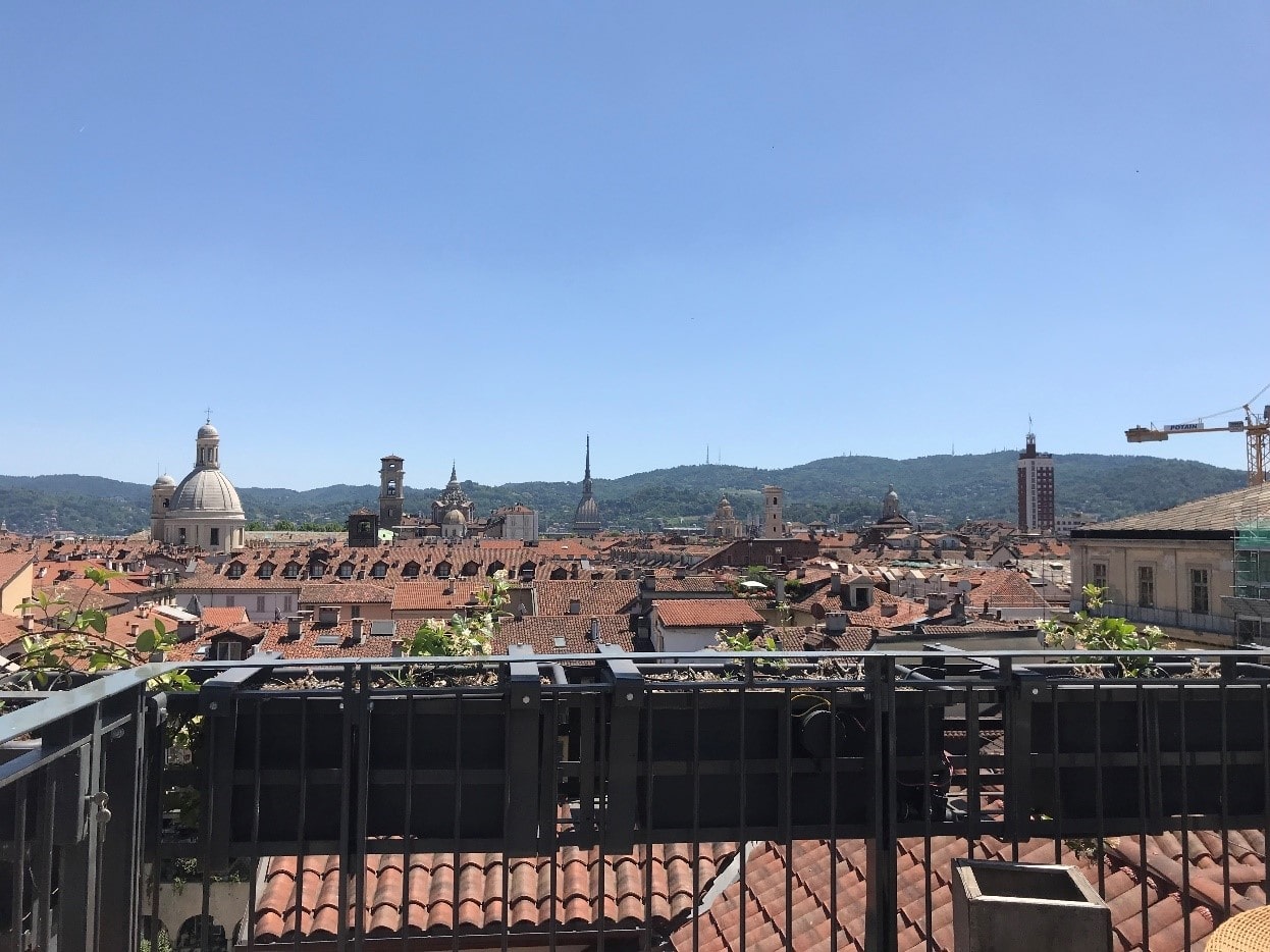
The staircase leading from the attic floor to the terrace overlooking Turin
Images © Chiara Del Core
To get to know Quadrato better https://quadra-to.it/#
Cru house: warm minimalism
Not far from Quadrato, in the same neighborhood, Cru house, named after one of the hosts, the cat Crusco, attracts my attention.Inside a building of the late 1600s, owned by a general of the Savoja family, the apartment on the first floor has undergone a renovation that has completely transformed it. The hostess, Federica, is also the architect who designed the new spaces, in order to maximize the intensity of natural light coming from outside.
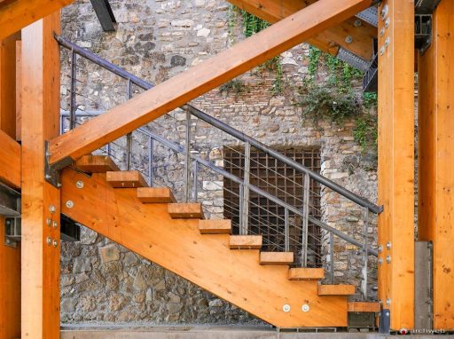
The project involved the demolition of the partitions that divided the kitchen from the living room and the mezzanine that previously had an L-shaped conformation. Characterizing component of the new living area is the staircase leading to the renovated mezzanine designed as a future small home office. Completely redone, it is composed of a metal structure with suspended steps embedded in the masonry. The parapet that protects the mezzanine area is made entirely of glass so as to allow a greater flow of light to pass.
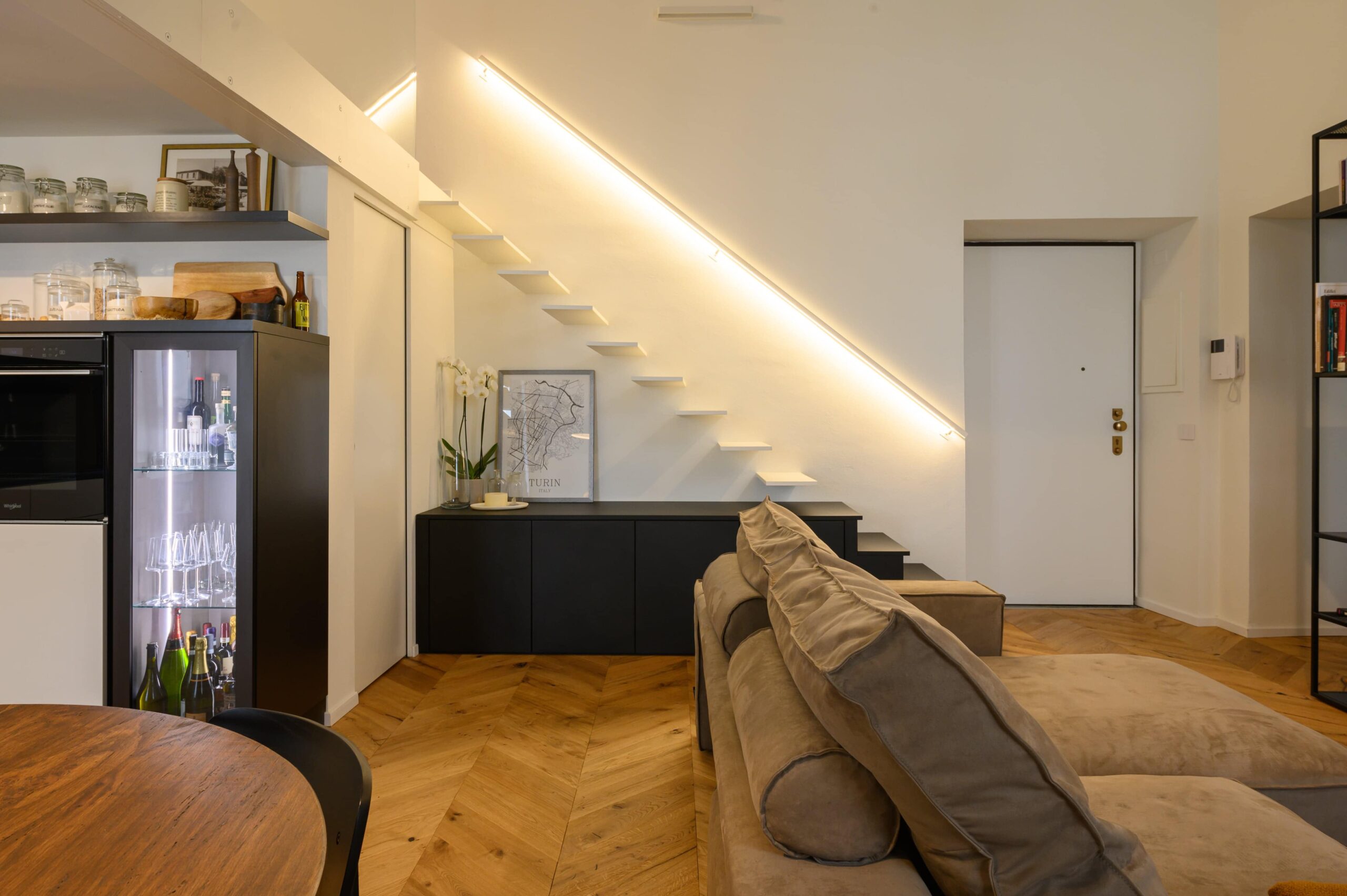
View of the new staircase that connects the living area with the mezzanine
Images © Arch.Federica Pettinato
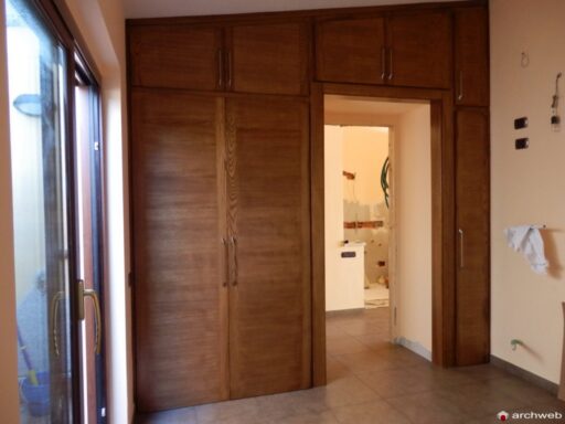
The artificial light has also been studied in detail to give each area the correct lighting: mood suspensions for the dining area, spotlights for a punctual light in the kitchen, a retractable LED strip for the stair handrail. A small bathroom with a retractable laundry room has also been created in the living area thanks to the use of a built-in wardrobe.
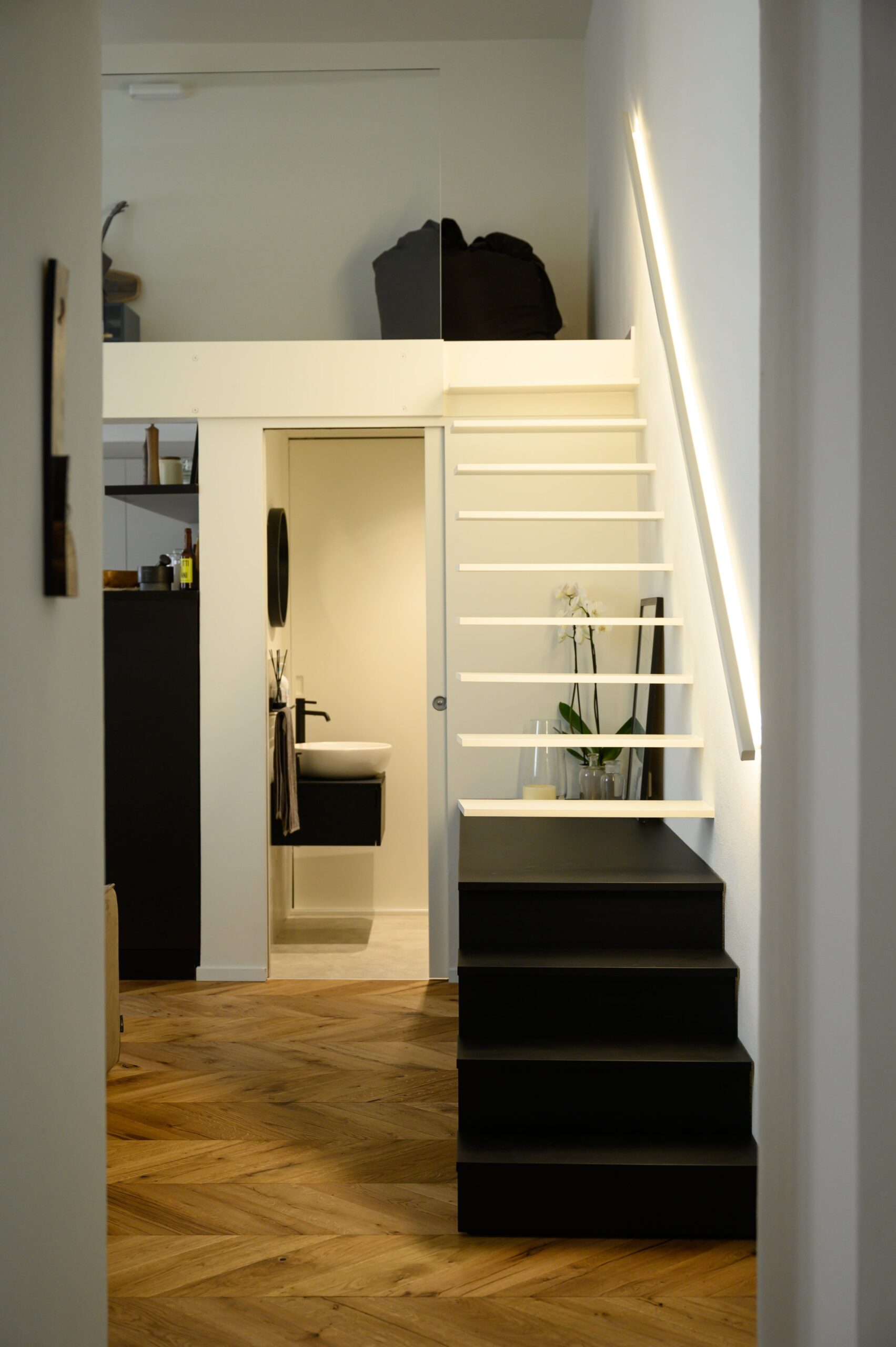
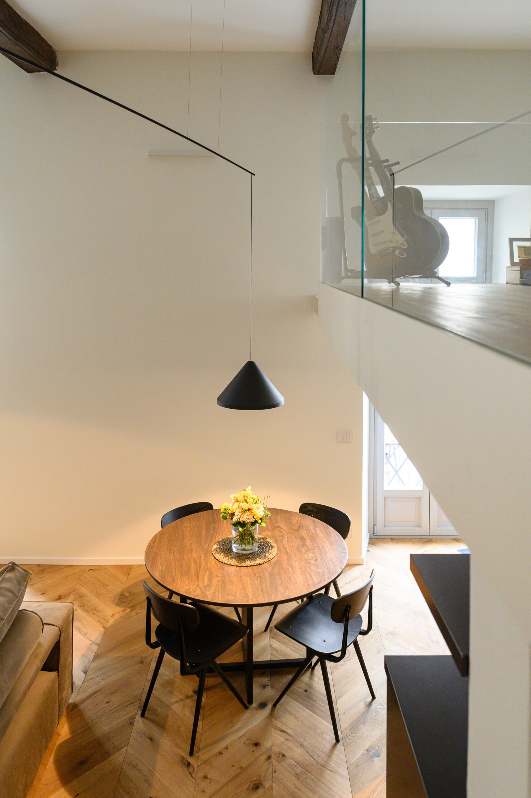
View of the service bathroom and the dining area from the staircase
Images © Arch.Federica Pettinato
Moving from the living area to the sleeping area, it is inevitable to notice how the ceilings characterize every single room as one is different from the other. In fact, if the living area is equipped with a simple white plastered ceiling, the current home studio is characterized by a splendid pavilion vault. The latter has been peeled off, sandblasted and in some areas restored through the application of carefully selected pigments in order to give greater visual uniformity.
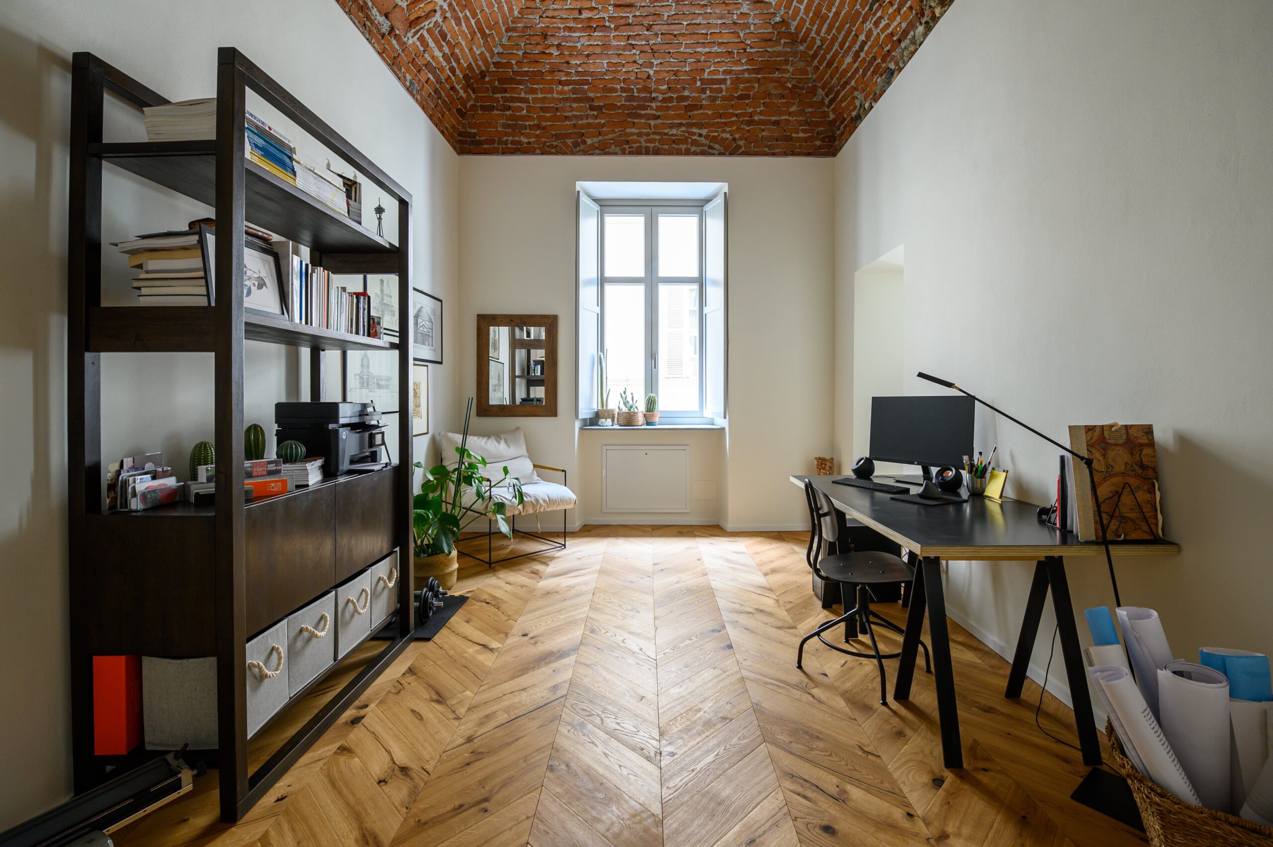
View of the room intended for the current studio, characterized by a splendid pavilion vault
Image © Arch. Federica Pettinato
The last room, the one intended for the master bedroom, is instead dominated by a wooden coffered ceiling that has been reinforced through the insertion of special beams. It is inevitable here to note how the mix of ancient and modern materials results in a perfect harmonious relationship.
All the floors in the apartment have been replaced with a herringbone natural oak parquet, in order to obtain an overall warm and rustic look.
Finally, all the existing systems were revised with the affixing of underfloor heating and with a retractable air conditioning system that affects only the sleeping area.
The result? A fresh and young apartment, studied in every detail, which fits with refined calmness in the heart of the Roman Quadrilateral.
To view the drawings of an air conditioning system click here
© Archweb.com reserved reproduction – It is possible to share with a link to the page
Terrazza Dora: a Zen corner on the banks of the river
In the old Paracchi carpet factory, from the recovery of the 2000s, today there is a complex of offices and lofts overlooking the Dora River, in the northern area of Turin. Terrazza Dora is the loft with an authentic Japanese flavor, it is the place of Sayaka and Enrico, who fell in love with the apartment and immediately grasped its potential.The loft, developed on two floors, blends harmoniously with the nature of the surrounding environment, restoring light, peace and silence to those who enter it. The first floor, a large open space, houses the living area with a corner kitchen, completely surrounded by windows thanks to which the environment seems to be the natural extension of the outside, made of water and greenery. The adjacent conversation area continues into the large terrace overlooking the river, where there are numerous plant species in pots surrounding the dining set.
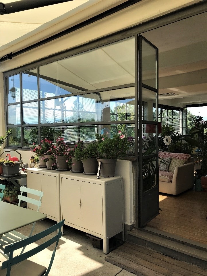
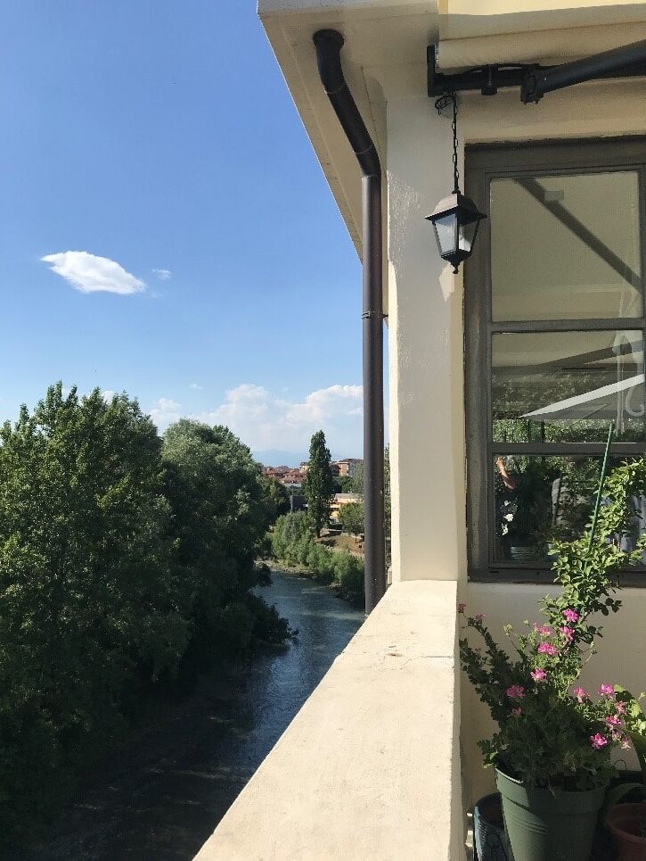
Exteriors of the loft: the furnished terrace and overlooking the river landscape
Images © Chiara Del Core
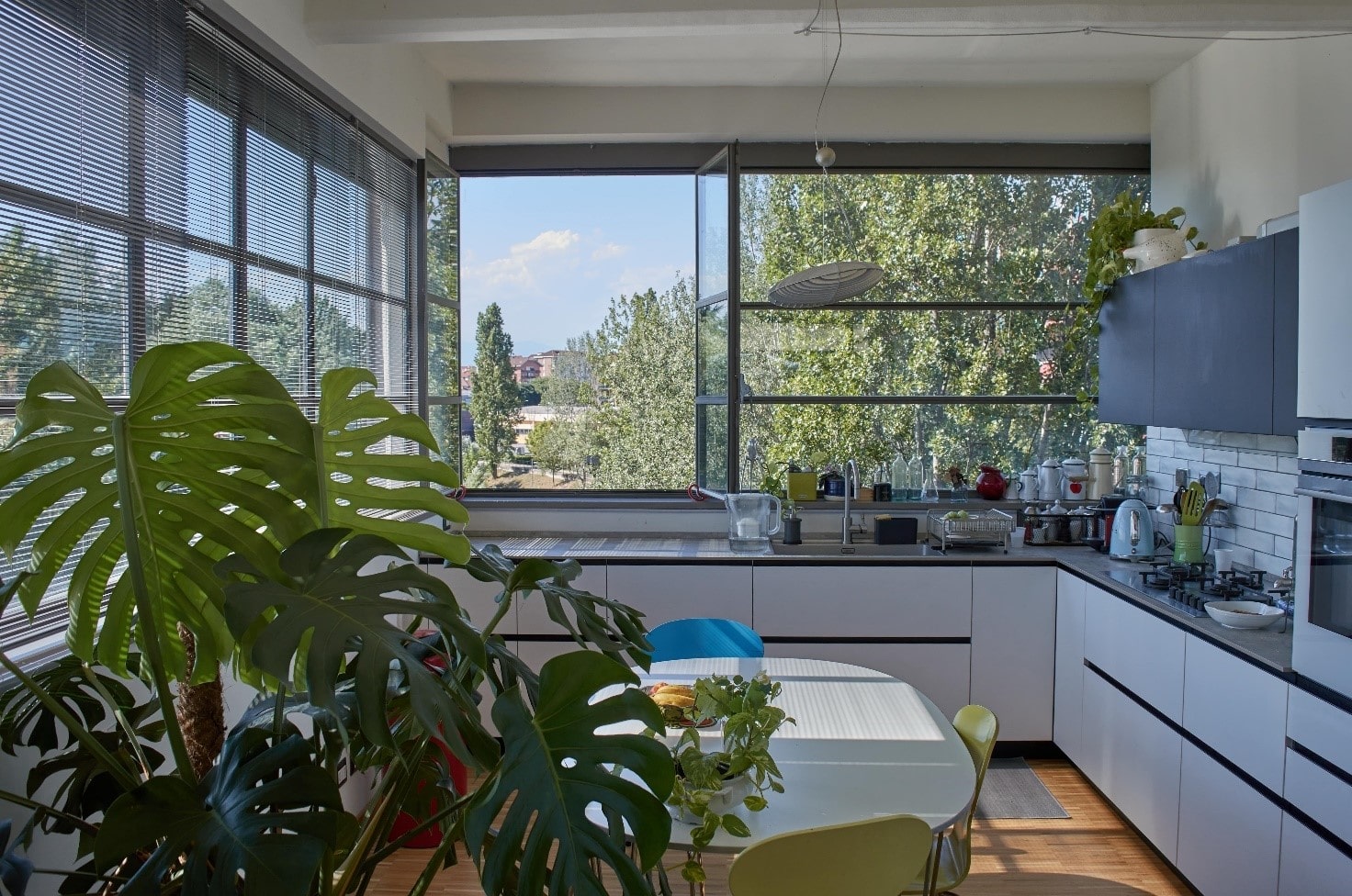
The kitchen area immersed in the surrounding greenery
Image © Chiara Del Core
An internal staircase leads to the second floor, a real corner of Japan inserted in the austere Savoyard city. A bright and glazed space where the tatami is laid on the ground, a traditional Japanese flooring composed of modules in woven straw. It is a very flexible area, used by homeowners as a space in which to talk and have a meal, but which, if necessary, becomes a guest room.
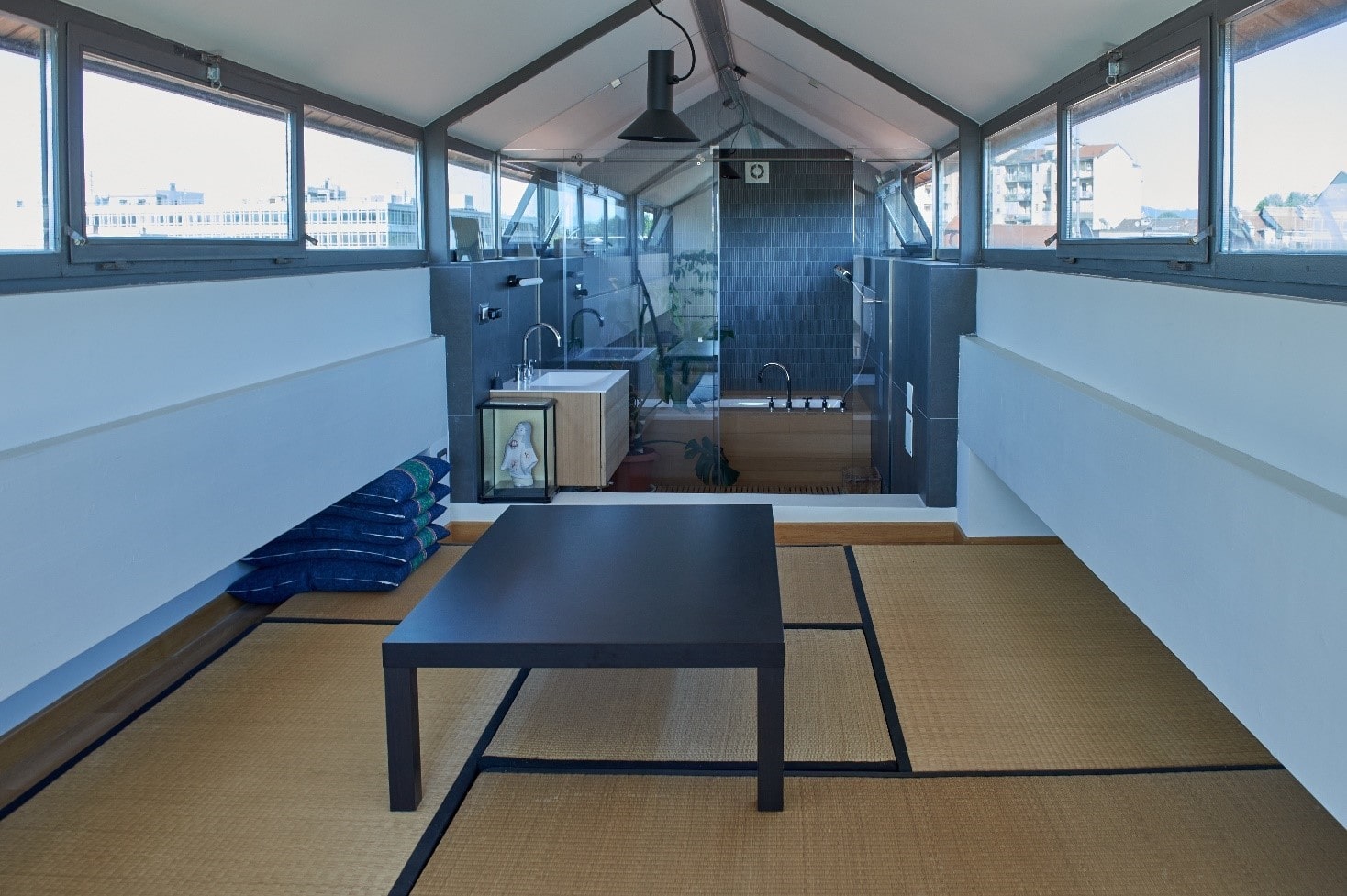
Tatami in the convivial area and adjacent bathroom
Image © Chiara Del Core
Next to it, a bathroom with a generous bathtub designed to relax and turn off the switch from the frenetic pace of everyday life. To complete the first floor, the second terrace offers a view of the river at high altitude, becoming the crowning glory of a loft that is the perfect union between East and West.
Today, Terrazza Dora is not just a private home but a dynamic space where vernissages and photo shoots take place, a unique and hidden place that is worth discovering.
Luini 33: space-proof house-studio
Luini 33 is the real demonstration that for the designer the small space can be interpreted as a challenge aimed at maximizing the result and not just as a mere constraint.Davide Minervini is the architect and the owner of the house who carried out the internal renovation project of the small apartment in the Borgo Vittoria area. Inside a building from the 1950s, the 39 square meters of the Luini house have been completely revolutionized, with a planimetric reorganization that has seen the replacement of the sleeping area with the living area and vice versa. The primary need was to exploit every available centimeter by creating a housing unit that offered everything that would need those who would have lived there.
Today, the entrance to the living room offers a conversation area with a two-seater sofa and TV, a dining corner that can become a home workstation if necessary and a wall with a retractable kitchen. This last solution, designed to measure, guarantees the double use of the environment which can thus be transformed according to the need. The French window gives access to the small terrace overlooking the street.
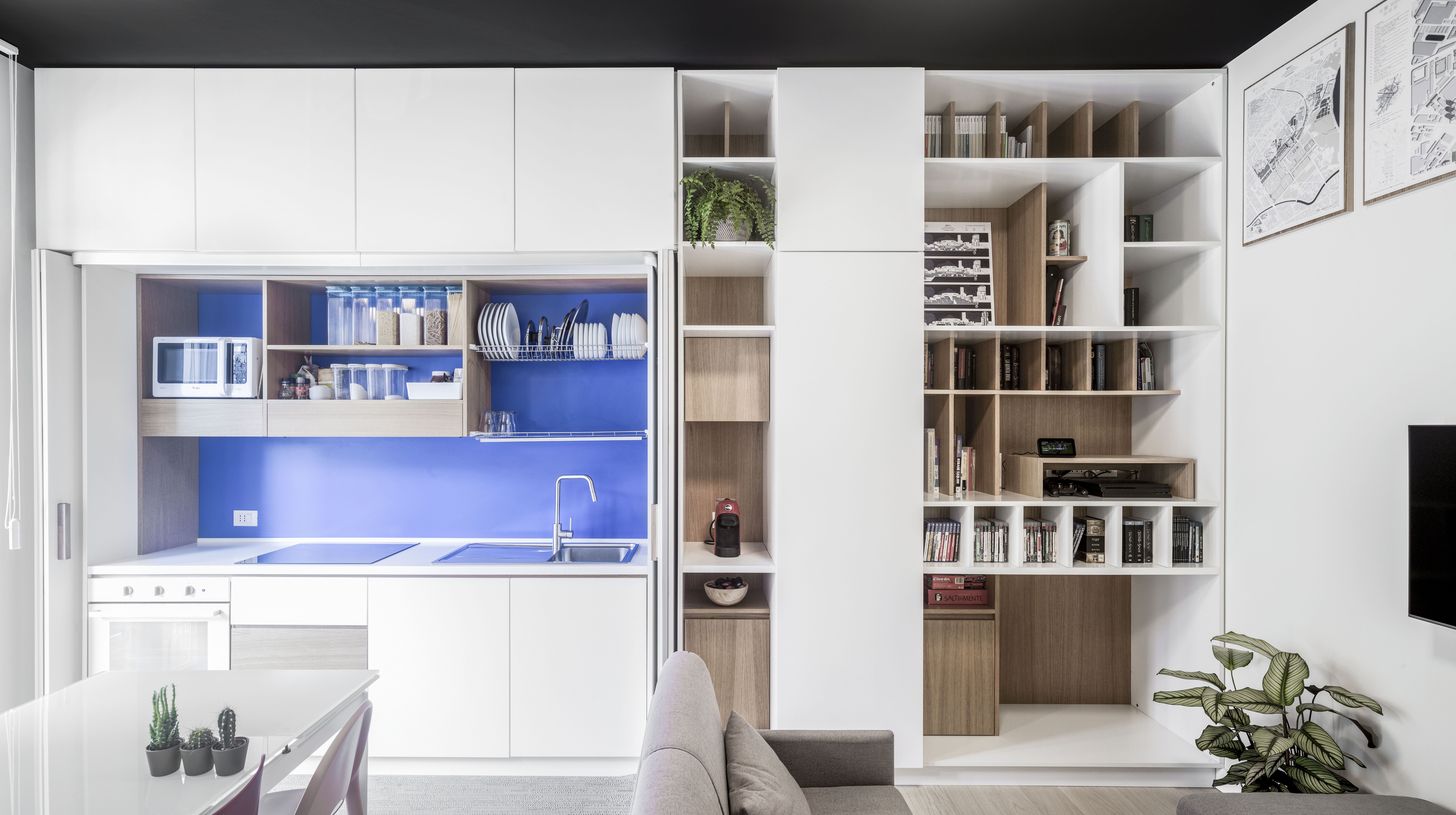
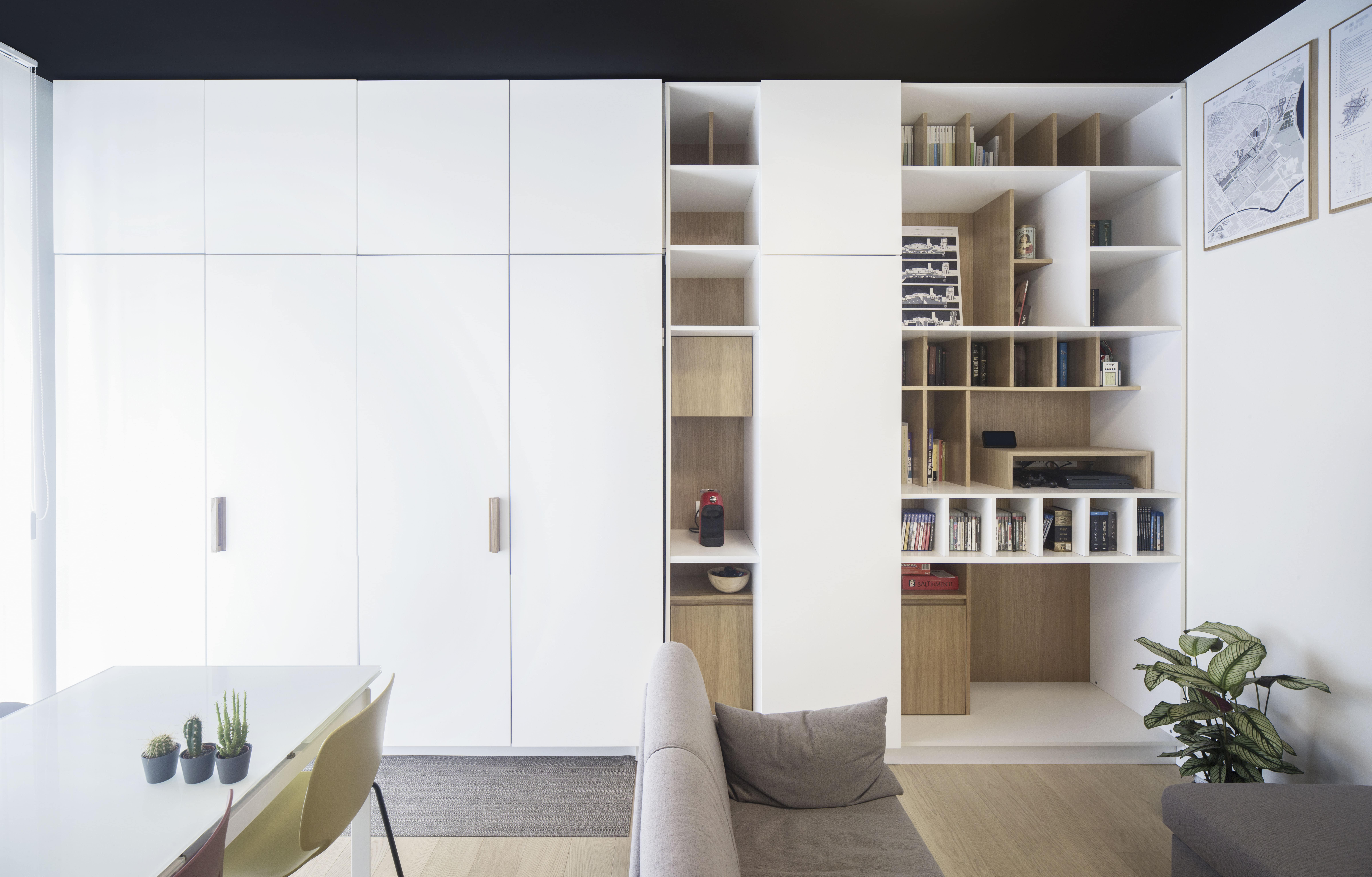
The environment can be a dining-kitchen area but also a study thanks to the retractable solution
Images © Alessandro Santi
A filter area was then created that allows the passage to the sleeping area: it is a small corridor of 1.5 square meters characterized by a double-sided containment wall. In fact, the wall on the entrance side can be used as a wardrobe and pantry, on the corridor side as a laundry area hidden by the sliding door.
Opposite, the bathroom has been revisited but not moved, creating a small closet area divided by a polycarbonate door which, in addition to dividing the intended uses, ensures adequate light flow from the outside.
What was once the dining room with kitchenette has now been transformed into a bedroom with a large walk-in closet. Even the sleeping area has been studied in every detail to meet the needs and expand the spatial perception. The gem of the room is the study corner equipped with a particular desk which, similar to a bar counter, can be raised to ensure maintenance of the radiator below and to better access the window and enjoy the view.
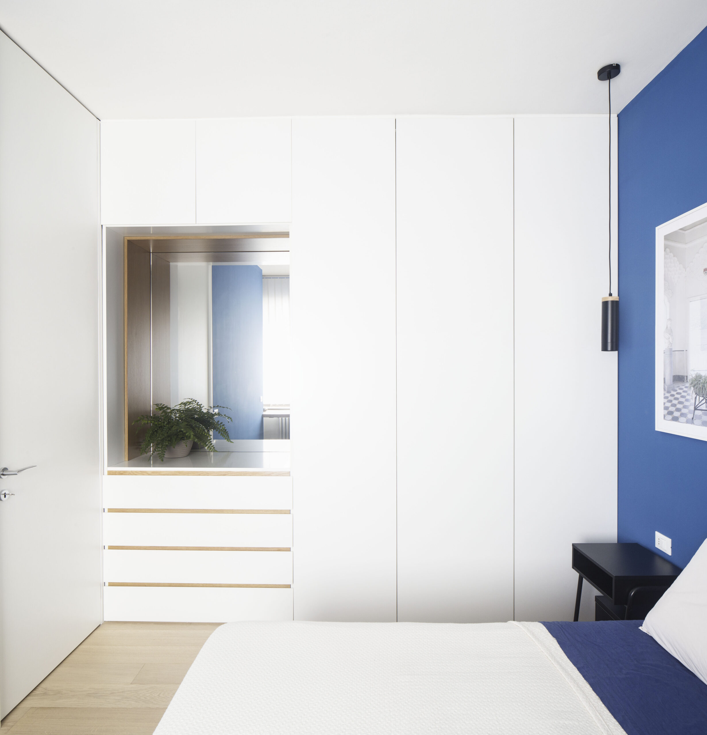
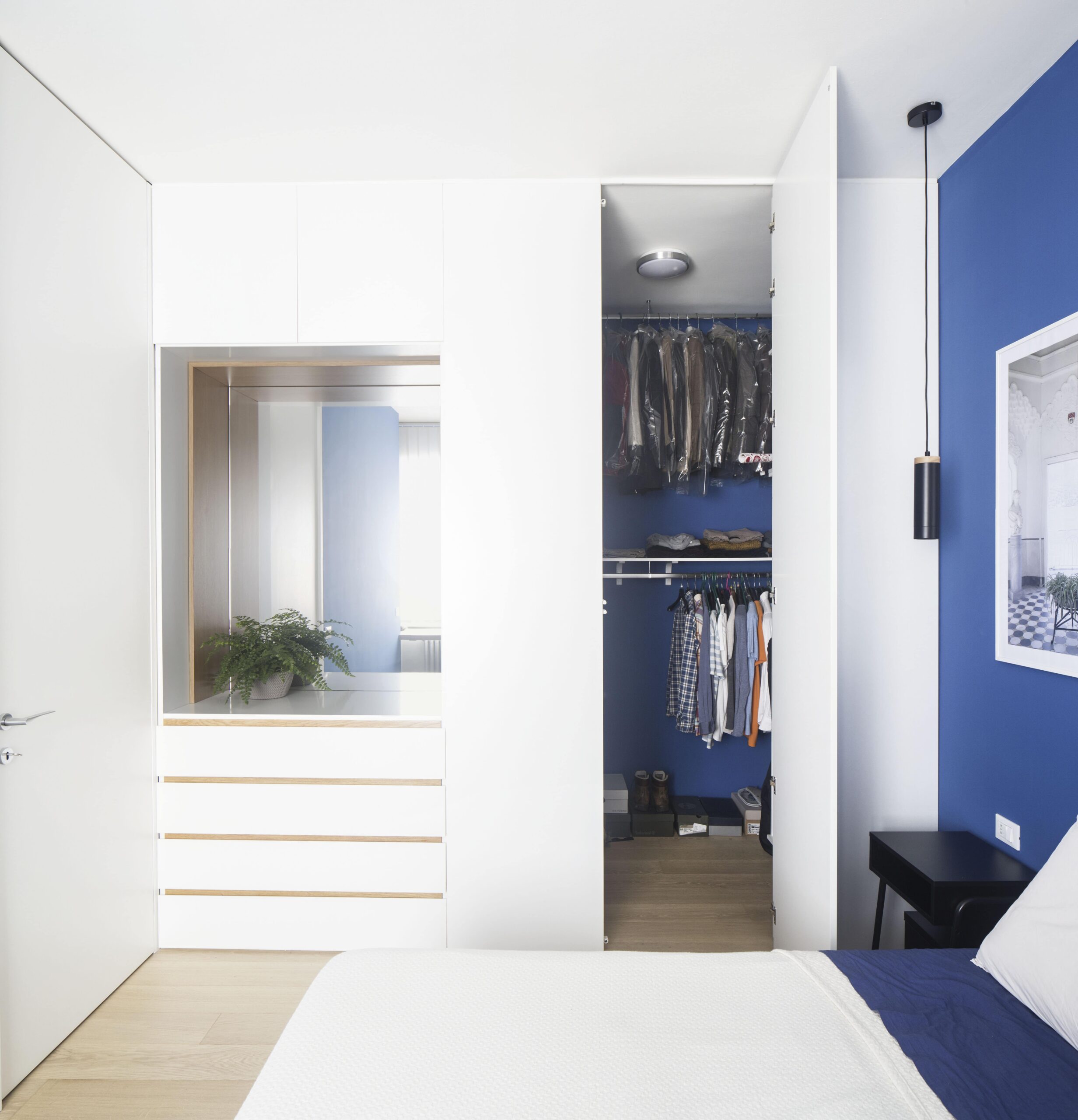
The walk-in closet occupies the space of the former kitchen
Images © Alessandro Santi
Luini becomes an emblem of functionality and clever design: a house, a studio, a space designed on a human scale ready to change according to the needs of the moment.
Palazzo Cassini 34: facade retrofit and new interior spaces
Inside the Turin residential district of Crocetta, we find Palazzo Cassini, at number 34 of the homonymous street. It is a building built in the 1960s that was completely renovated by Studio Garrone Architetti in 2019-2020. The intervention involved both the external facade and the apartments that are distributed over the five floors above ground. While the side in the inner courtyard has been completely demolished and rebuilt, the one facing the street has been the subject of a more conservative intervention, since the building is bound by the city master plan.The retrofit on via Cassini involved some technological choices that have restored a relevant and new identity to the building: the first concerned the old hand guard casing, renovated with corten steel, a material capable of regenerating itself over time.
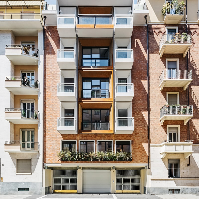
The facade of Palazzo Cassini 34 on the street side
Image © Open House
In order to maximize the inflow of light from outside, the openings already present in the facade have been merged, thanks to which the living area of each apartment now enjoys optimal brightness. The inclusion of numerous plant species in pots, in addition to making the building more valuable and vital, ensure a good level of sound insulation for the interior.
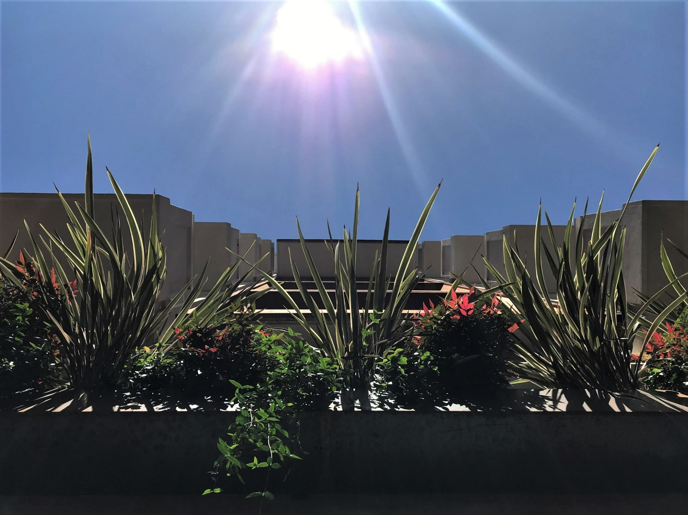
View from the bottom to the top of the building
Image © Chiara Del Core
On the first floor of the building we visit the professional studio of the architects who took care of the entire renovation. The interiors, with a contemporary flavor and embellished with numerous works of art, boast an added value: the pleasant internal garden that was once a condominium, which has now become a pertinence.
The visit continues in one of the apartments on the fifth floor, once characterized by narrow corridors and the division of space into multiple rooms. The renovation involved the demolition of the partitions and the creation of a large living area divided into three main areas: the kitchen with island and walls that house the storage columns, the dining area and the relaxation-conversation area.
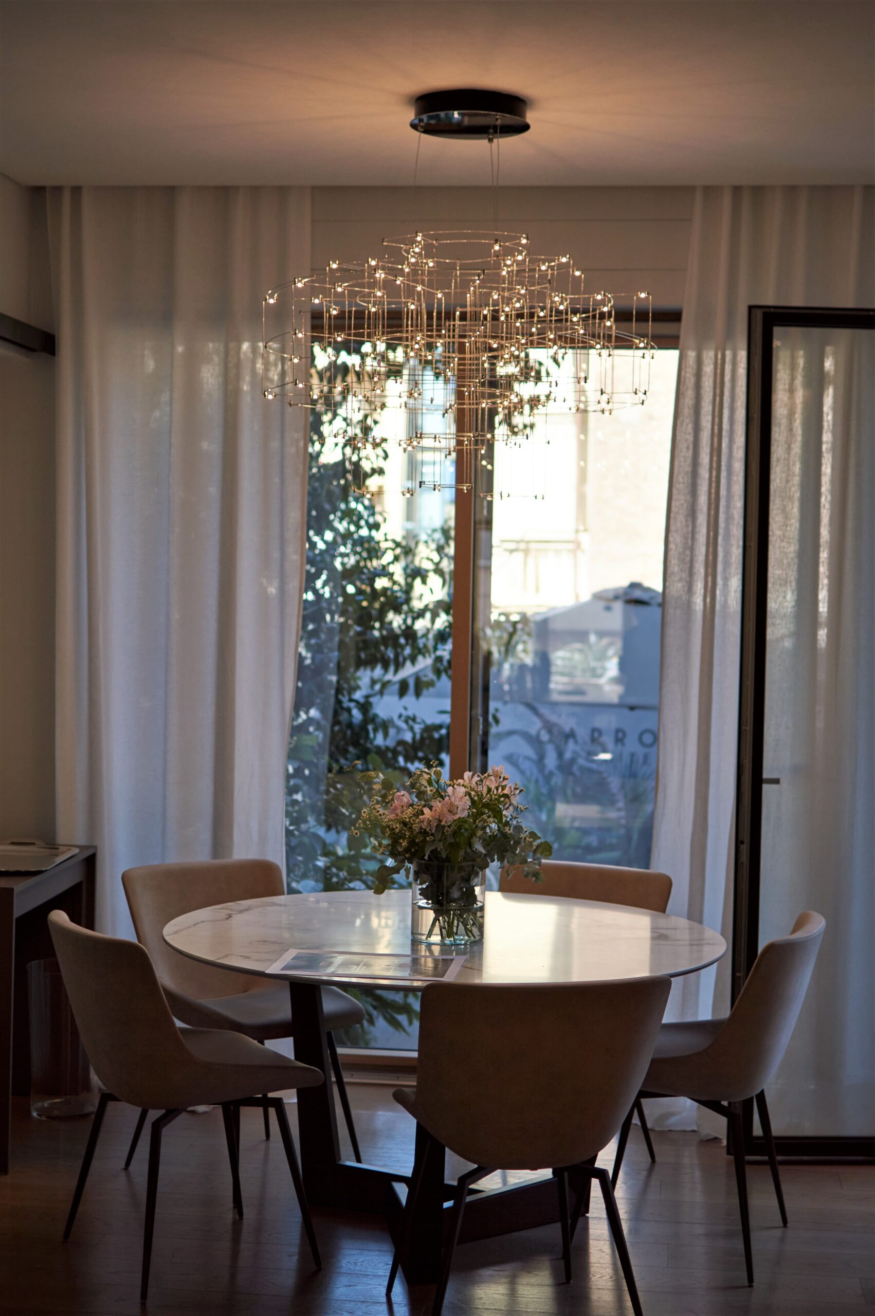
View of a corner designed by the Garrone Architetti studio
Image © Chiara Del Core
An unusual choice from a technological point of view, was to insert a ceiling heating system, with serpentine systems embedded within the plasterboard panels that make up the false ceilings. In this way, each room was lowered and the designers were able to play with jumps in height, with the recessed lighting and with the curtain supports.
For the service areas, materials such as stone and dark-toned colors were chosen, in order to emulate the typical atmosphere of a spa.
The master bedroom has a soundproofing system and the wall behind the bed has been embellished by the insertion of a particular velvet wallpaper.
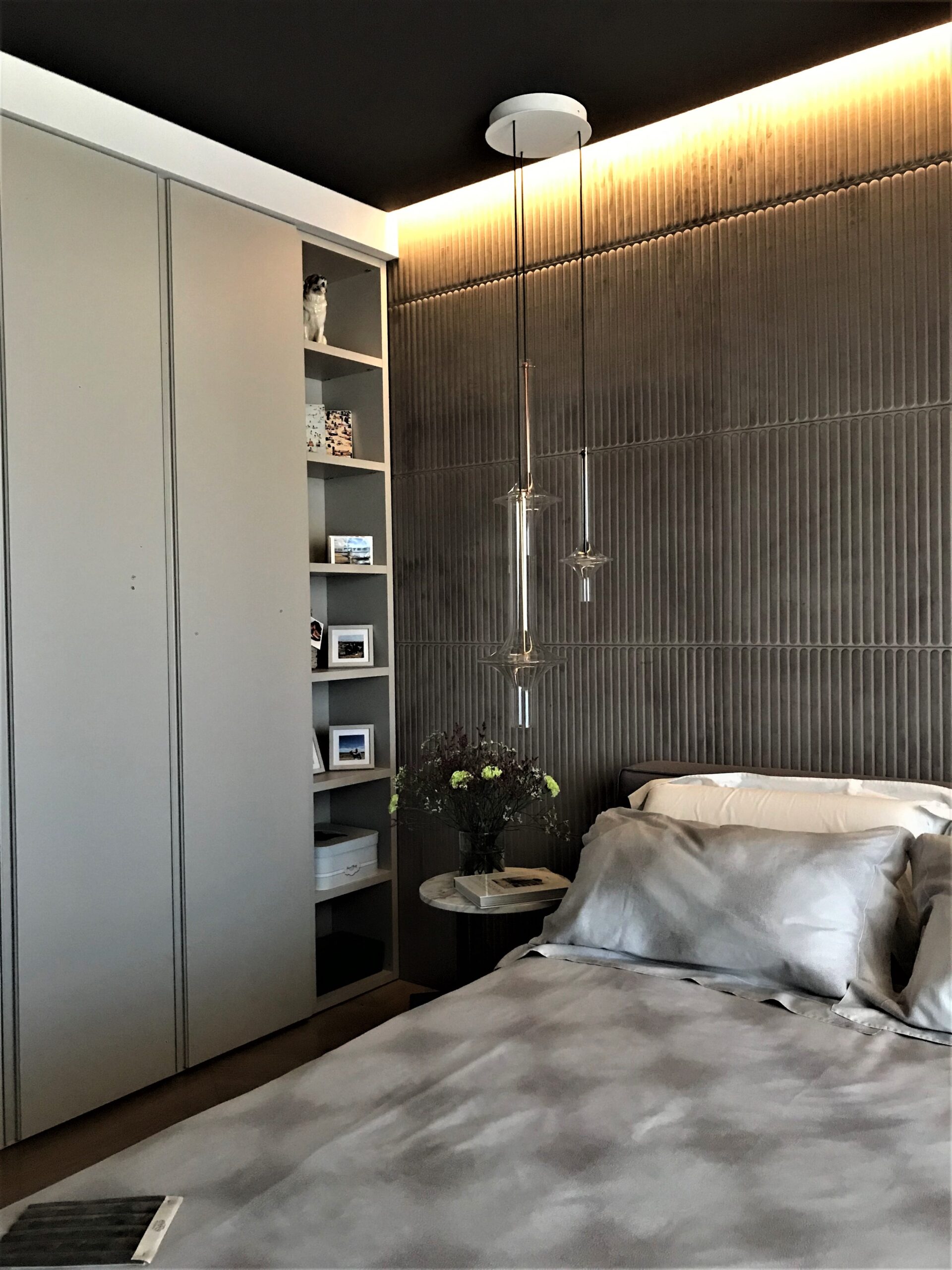
The bedroom where the velvet wall characterizes the whole environment
Image © Chiara Del Core
Palazzo Cassini 34 is the demonstration of how careful planning can return an optimal result in terms of comfort and environmental quality.
To learn more about the theme of acoustic design click here
© Archweb.com reserved reproduction – It is possible to share with a link to the page
