The setting up of the store
Interior design and its role for optimal results
Always considered a place of commerce, the city since its origins has hosted workshops and emporiums. In fact, the store boasts very ancient origins: the artisans’ workshops were born as locations where production and direct sales took place. They presented themselves as small environments that included production and commercial activities in a single space. It is only later that there is a functional division between the laboratory, accessible only to the craftsman and the place of sale intended for the public, in front and overlooking the street.
During the nineteenth century, the spread of industrialization caused a functional change in the old shop, declining it exclusively to a place of sale, where the finished product used to come from detached production spaces. In this period the “passages couverts” of Paris find their maximum development, covered galleries with a strong identity, which housed shops and cafes. These were sheltered and intimate places where lights, signs and shop windows were the protagonists and where we met to greet and socialize.
All the passages consisted of a metal structure and a glass casing which guaranteed the light to filter during the day. Floors, lamps and finishes were chosen according to the taste of the time, in order to convey the feeling of being in familiar places. The longitudinal distribution of the shops on both sides ensured the free development of long walks and the vision of the countless goods on display.
Each store was structured according to its size and specific needs, while the layout strictly depended on the type of goods displayed and marketed. For example, in the case of food, these were kept inside closed and inaccessible windows for hygienic reasons, while the shops of precious fabrics and accessories were provided with display spaces with attention to the smallest detail. For this reason, the set-up and finishing choices changed depending on the nature of the goods, the message that was wanted to be conveyed and the public to whom it was addressed.
The desire to merge leisure time with shopping and socialization proved to be of fundamental importance for the success of the passages which were very successful until the end of the 19th century with the advent of the department stores. The places that host them are large, sometimes spread over several floors and shops find space in buildings built for this purpose. These are areas where the public is free to move, to observe and touch the products displayed in large quantities.
The type of experience for the customer and also his relationship with the seller has changed: the furnishing accessories designed to materially divide the purchase and sale functions are now absent. The surface, the organization and the layout change and together the human relationship changes. The space of goods acquires a new function which is based on the triple relationship between commercial building – city and consumer – room. Each architectural and commercial choice must emphasize the goods and their purpose, inducing the consumer to purchase. The study of the lights and the free movement within the warehouse are the elements that determine the quality level of the design. The progressive evolution of department stores led to the spread of shopping centers, introduced in the 1920s.
Interior design plays a definitive role in achieving optimal results, since we often find ourselves in front of sheds and large standardized complexes. These are highly articulated complexes that house different functional areas within them: supermarkets, shops, services, rest areas and entertainment areas.
The meeting and gathering place is par excellence, where different functions merge and where purchasing becomes one of the many activities that can be carried out there. For this reason, great care must be taken in designing the layout of each individual store, making good use of marketing and brand promotion.
The set-up plays a fundamentally important role, in addition to hosting the products, it must amaze the visitor and encourage him to buy. The dizzying development of industrial production, the change in family habits and the possibility of reaching these commercial containers by car, even in peripheral areas, change the concept of purchase and the place where it takes place.
The design choices are shaped by the changing social model and the setting up is interpreted as a means of communication capable of increasing the value of the product. Thanks to this concept, the first Concept Stores were introduced during the 1980s of the 1900s, where everything is designed in line with the brand on sale. It is from this moment that the design assumes the term of retail design and is characterized by the multidisciplinarity of the figures who work there. The project becomes communication, loyalty, involvement, technology and must be distinguished according to the brand and the target to which it is addressed.
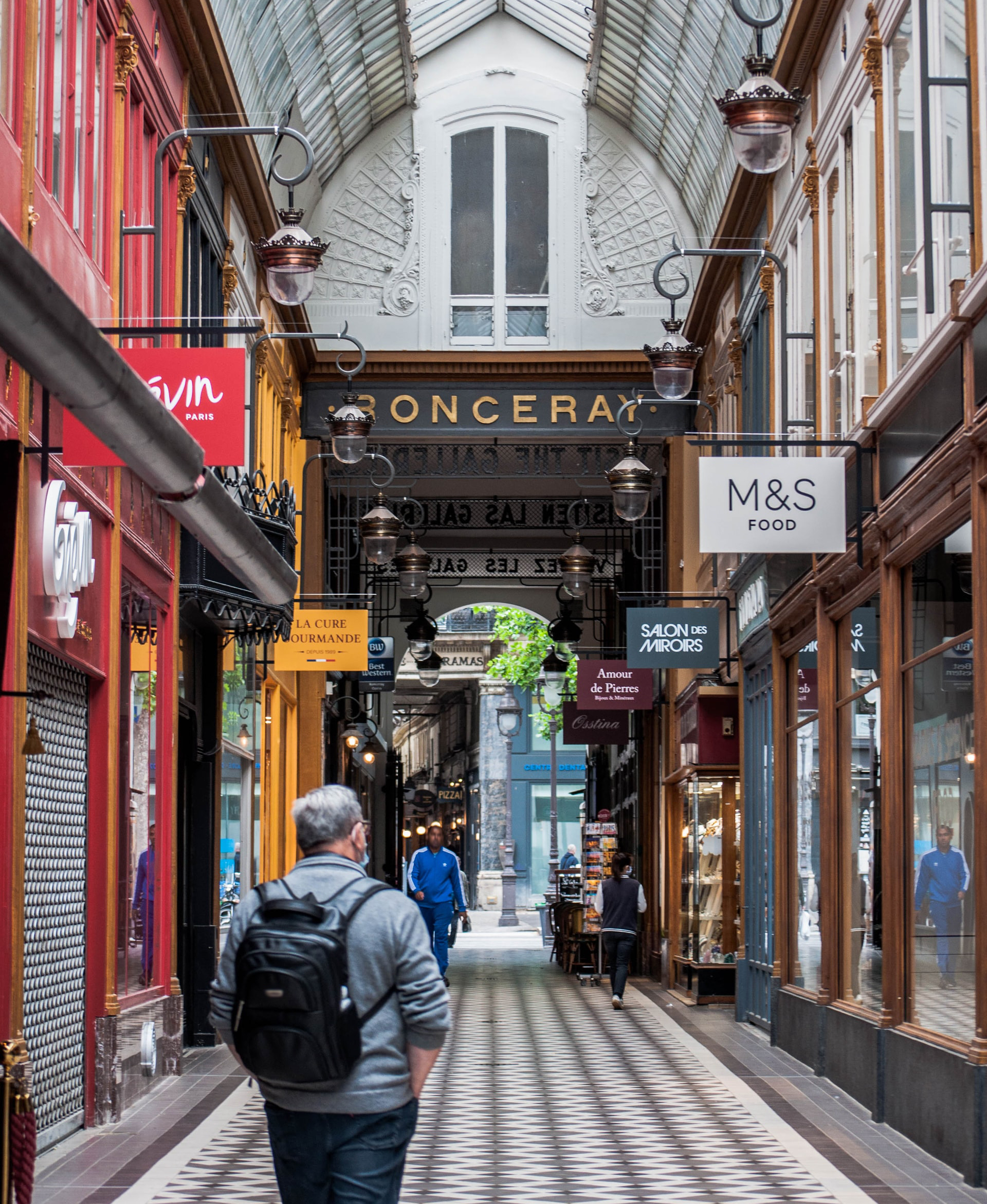
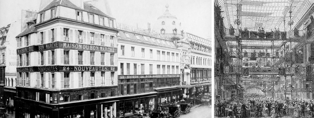
Photo: Le Bon Marché Rive Gauche – Archivio
The layout and its relationship with the market demand
Over the centuries, the public’s approach to the commercial market and the physical spaces linked to it has changed significantly. In fact, if at one time the objective was to satisfy primary needs by gaining consumer confidence through product quality, today the situation is quite different. The trend is to satisfy an attentive public with secondary needs and looking for satisfactory consumer experiences. Added to this scenario is the emotional, emotional and active aspect of the user. From a design point of view, specific objectives correspond to a certain type of set-up that has undergone great transformations over time.
It is possible to trace a sort of development in stages which have followed one another in three successive twenty years and which have seen the project evolve in this way:
- 1950 – 1970> PRODUCT ORIENTED
Tendency to place the product at the center of the project
Objective: to satisfy primary needs
Preparation without experiential paths, allows the free movement of the user
- 1970 – 1990> BRAND ORIENTED
Tendency to place the brand at the center of the project
Objective: to satisfy secondary needs
Set-up conceived as an immersive space capable of giving a 360 ° experience to the public. Through the spectacularization of the goods and the correspondence between the image of the store and the brand identity, the consumer lives an experience thanks to contact with the specific brand
- 1990> USER ORIENTED
Tendency to place the public and its perception of the environment at the center of the project
Objective: to create new experiences and transform the user from consumer to consumer-actor
Preparation with attention to every detail and studied to create a brand vision. The exhibition space becomes one with the product on display
The idea that the potential of the product should be maximized through the setting up inside the store which constitutes a direct communication and marketing channel for the brand and the production house is becoming increasingly widespread. For this reason, the set-up becomes identity and must be able to make the customer experience. The approach to the project now incorporates innumerable disciplines which have as their main purpose the well-being of the buyer and which involve the contribution of different figures who collaborate with the architect. The graphic designer takes care of returning the correct corporate image, the visual merchandiser assembles the set-up according to the architect’s provisions, respecting the corporate values, the light designer is predisposed to ensure correct lighting comfort. The project team must work to ensure visitor involvement through a specific and identity brand image. In addition, the goods and their exposure must be taken care of, ensuring ease of management and regulatory security.
The store design
Starting from the first concept phases, the architect must study the physical space and design the displays for the goods taking into account some essential aspects for the success of the project. One of the most important factors is represented by ergonomics which, through the study of the correct proportions between the human body and the designed space, ensures accessibility for all. Another fundamental aspect is represented by the security that must be guaranteed to all those who frequent the store. To this end, there must be an in-depth study of the likely paths and movements of staff and the public with respect to the designed space.
The work done by shop assistants and collaborators must ensure the free conduct of the usual activities: between one exhibitor and another there must be adequate distance to flow in comfort, the shelves must respect human proportions and not be too high or too low to ensure the simple arrangement of goods. Furthermore, each piece of furniture must be designed and chosen according to the function it will perform. For example, while a counter used to show clothing must have a depth useful for this purpose and be accessible to the customer, the plan that will house the cash desk must guarantee safety and inaccessibility by the public in order to prevent theft and suspicious actions.
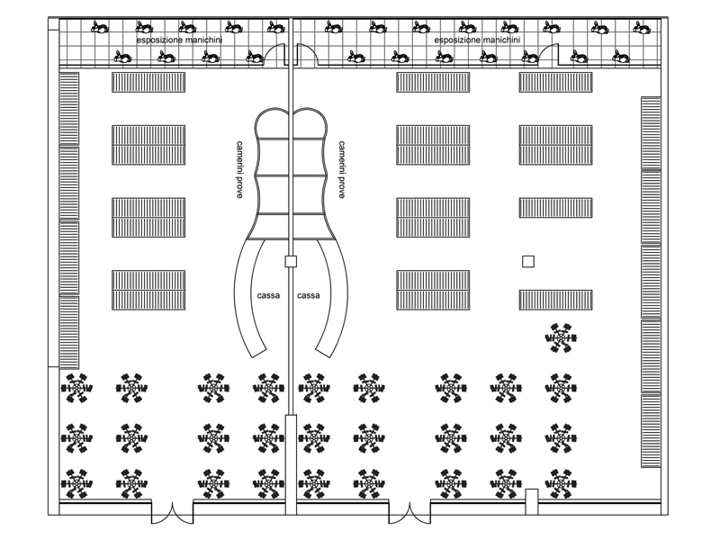
Usually, the shop is divided into a purely exhibition and sales area open to the public and a service area accessible only to staff. The first includes the customer’s entrance, the area set up and aimed at displaying the products, the service areas made available to the public (dressing rooms, mirrors …) and the area intended for the payment of the goods provided with a plan of support for the cash register. As for the second section that is part of the store, it is an area reserved for store employees that includes warehouses, the loading-unloading area and logistics offices. On the external and contiguous part of the store, two important indispensable elements are placed to attract potential customers: the sign and the shop window.
As for the sign, it must be studied according to the flows of people and positioned correctly in order to be legible. This component constitutes an evocative element of the brand image and is often found illuminated in order to indicate the presence of the store even in the evening and at night. The system can include neon lights positioned and chosen to backlight it, to create silhouettes on the trace of the font belonging to the brand’s own logo or simply to point the light on the sign.
In the same way, the showcase must be able to be observed, it must ensure cleanliness and guarantee safety by choosing shatterproof glass. Furthermore, depending on the place and the building that houses the shop, the showcase must respect its characteristics: in the case of ancient shops it is often found in a backward or elevated position, while in modern reality such as those of shopping centers you have much more design freedom. Here it will be possible to place it inside the shop, highlighting its position through plays of light and reflective panels, they can be equipped with portals designed to amaze or interactive frames chosen to attract as many potential customers.
The showcase also differs according to the size of the store: in the case of very large areas it can be in the “closed” and independent form with respect to the interior spaces of which it provides a preview. In the case of smaller boutiques and shops, the showcase will be a continuum between the internal and external space. In any case it is the business card of any commercial reality and for this reason it must be chosen and designed according to the particular context in which it is located.
From an organizational point of view, each space is designed to be functional and aesthetically appealing: what matters is to involve the customer and not to bore him. To this end, the routes within the set up space must include attraction poles and stops that ensure a pleasant experience for the visitor. The service areas that include the dressing rooms must be clearly visible and the dimensions of each cabin must respect the ergonomic and functional needs of the user.
The minimum dimensions correspond to approximately 1.80 m2 for each dressing room. In addition, it is good to ensure the lighting, acoustic and thermal well-being, through the use of systems compliant with the law. The general rule establishes that an overall project conducted according to criteria and attentive to the needs of the public will encourage the latter to return to the shop several times, otherwise it is necessary to promptly intervene for the optimal continuation of the activity.
Retail design
Once the functional areas, paths and plant integrity have been studied, it is necessary to choose the best furnishings and display equipment, distinguishing between areas with fixed equipment and flexible and interchangeable areas. The former contribute to the store’s own identity, transmitting the values of security and stability, while the latter stimulate creativity and amazement in the visitor. The latter are designed to periodically reinvent themselves and shape themselves on the needs of the moment.
The furnishings are therefore divided into two categories: fixed and mobile. The former are incorporated into the shop structures, designed to remain unchanged, the latter instead consist of individual pieces that can be moved or replaced according to need. In addition, the furniture can be designed ad hoc, according to the craftsmanship and tailor-made based on the characteristics of the place and the environment in which it is inserted, or it can be chosen standardized, at a lower cost and adaptable anywhere. The components of the set-up designed for the shops are innumerable: panels, shelves, cubes, display cases, counters, floor and ceiling displays, baskets, mannequins, are just some of the essential elements for a complete project. At the base of each type of choice, each furniture must be equipped with dimensions suitable to ensure a comfortable vision that is accessible to the public and aesthetically pleasing.
Visual merchandising studies precisely these aspects using the design of display, lights, colors and graphics in order to make the environment comfortable and measured on the target and on the brand. As for the exhibition area, the walls that will accommodate the products to be sold will have a maximum height of 2.10 meters and will be visible from variable distances.
If the setting is aimed at attracting customers, the walls will be visible from afar, sometimes even from outside the shop. These are projects aimed at making goods spectacular. If, on the other hand, the articles are very small and detailed, it will be preferable to have an equipped wall that urges the customer to approach it.
The display walls can be continuous with shelves that are all the same, made up of alternating low and high shelves or still formed by full (drawers for the supply of products) and empty (shelves with the goods displayed). If the products on sale have a particular value, they can be enclosed in windows that can only be opened by the staff. These components have horizontal, vertical distribution or are placed above display counters or used as a support surface in the cashier area. Sometimes, more diversified shapes are designed with glass shelf above, inside which novelty or higher value products are displayed: an example are the showcase tables located in the center of large stores.
The choice of furniture for the exhibition presupposes good functionality and aesthetics suitable for the context, the type of goods and the brand. To this end, the display systems must best present the product and attract the customer, they must always be current and guarantee a certain flexibility in terms of setting. In fact, the set-up must be taken care of according to the period of the year through the rotation of the products and the appropriate decorative system.
Another aspect of fundamental importance is represented by the lighting of the sales point: correct design is in fact a basic prerogative to involve the potential buyer and ensure the optimal level of comfort. It is necessary to specify how the same develops on three levels: ambient, path and accent lighting.
The first type is necessary to brighten the environment in its entirety, without creating annoying shaded areas or neglecting part of the store. Luminaires equipped with light from above that illuminate floors and walls are usually used. The lighting of the paths, on the other hand, is designed to delimit and define the contours useful for visiting the store according to specific routes. Sometimes, when the aim is scenographic, recessed spotlights or cuts of floor lights are used which create a particular atmosphere and trace “ideal paths”. This typology is very important for the marketing of the product because the study of the position of the lights can direct the visitor to specific sales areas. Finally, the accent light is inserted with the purpose of enhancing details and products compared to the rest of the environment.
What turns out to be of primary importance is the ability to know how to correctly balance the three lighting levels so as to recreate a pleasant location, where the aim of the lighting project is to provide the correct level of light, but also to communicate and transmit particular messages to the public. To this end, the temperature of the light (3000 k – 4000 k) must be considered according to the type of goods on sale: the warm light will be perfect for clothing, toys and household shops while the cold light is indispensable for jewelry shops and pharmacies where more “technical” lighting is required.
It is good to specify how today, the physical store must support the ruthless competition of e-commerce and to do this it is necessary that the same be able to return real shopping experiences where light plays a fundamental role.
The set-up must involve and impress the visitor through the use of backlit elements, holographic panels and new technologies. The shop becomes a reference point for customers since it is studied on the needs of specific targets: the entire project is defined on the basis of the type of product and its recipients who, entering the store, recognize themselves and feel like home.
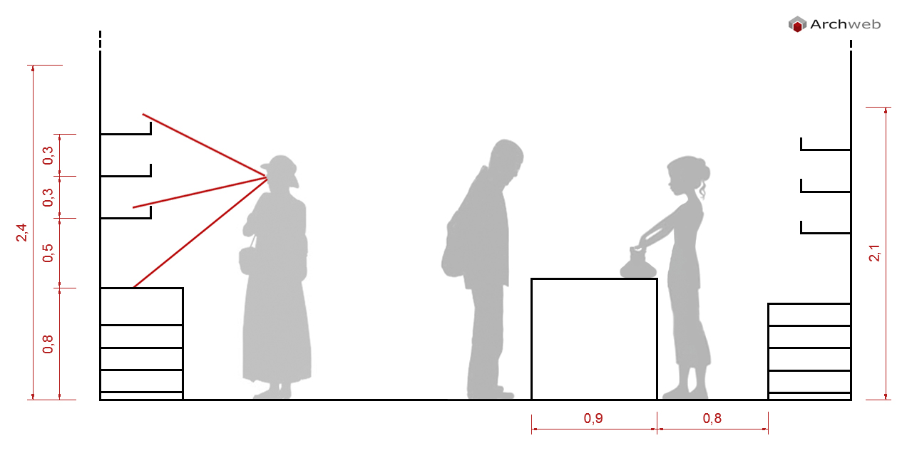
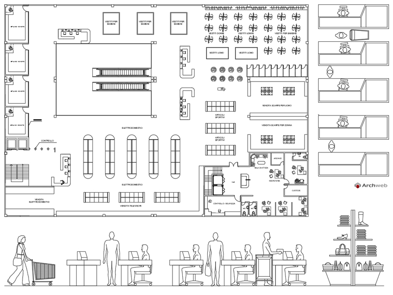
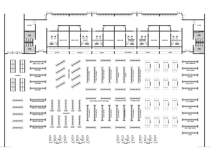
Click on the image to view and download our shop and commercial space drawings
The best material choices
As far as the choice of materials is concerned, the project concerning the point of sale must pay particular attention in this regard, since these are environments subject to continuous stress over time. For this reason, it is good to choose materials that are resistant and long-lasting, with finishes corresponding to the corporate image and that can ensure optimal comfort for the customer and the staff working inside the commercial spaces.
The flooring
Shop floors must guarantee simple maintenance in order to always be clean and pleasing to the eye, as well as being safe and accessible to everyone. There are countless fibers on the market suitable for this use and the choice is usually influenced by the style and corporate characteristics of the store. However, there are some materials that are mostly used: laminate, resin and stoneware. The first is formed by a stratification of composite filaments which aesthetically tend to imitate natural wood and by a superficial foil that makes it waterproof. The low cost and high resistance represent its strong point.
The resin, on the other hand, is mainly used in large stores and can be laid over pre-existing floors. It adapts to any type of environment but in more detailed workings the cost is higher. Finally, stoneware is the universal material par excellence: thanks to innovative treatments, it is able to restore the aesthetics of many natural fibers by offering greater durability over time at a lower price. In order to recreate a warm and welcoming environment, the wood effect will be perfect: with or without grain; it is similar to the original material but can be washed more frequently and resists constant trampling. If a more modern atmosphere is desired, a resin or concrete effect will be preferred which, thanks to the uniform laying, will guarantee perfect spatial continuity.
The walls also play an important role within the store: usually the color and material choices are made consistently with the corporate image and aimed at ensuring psycho-physical well-being. Innovative materials and modern technologies are increasingly widespread in stores to keep up with the times and contrast competition from e-commerce.
However, today the inverse tendency to use ecological and sustainable solutions is being established, aimed at protecting the environment, now in great danger. For this reason, it is always easier to observe, inside showrooms or temporary shops, fittings designed to be aesthetically appealing but designed with a particular focus on sustainability. An emblematic example of this is the Stella McCartney flagship store in London which in 2018 earned the title of the most sustainable shop in the world. Consistent with the corporate values of the fashion house, which for years has been fighting for the environmental cause by using only natural and regenerated fabrics, all the furnishings and fittings are made of recycled materials, vintage elements and biodegradable mannequins. In addition, a low-consumption air filtering system ensures clean and purified air from external pollutants inside the shop.
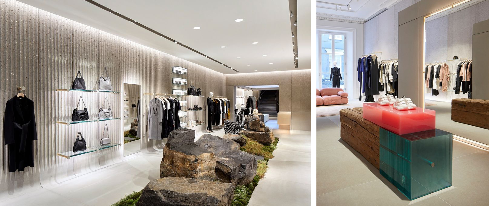
Photo: www.stellamccartney.com
To date, this example is one of the few created but destined for a considerable rise in the world of retail, with the hope of making a public that is too often inattentive more aware of issues of fundamental importance on a global level, more aware.
Types of store
In the construction of the store, at the preliminary stage it is necessary to define the type so as to understand what the optimal choices are in terms of size, layout and communication. The first major distinction concerns the duration of the shop: there are permanent shops and temporary shops.
Permanent shops
Since the 1980s, with the change in the consumer-product relationship, the trend has spread to create places of sale and experimentation and the concept stores and flaghship stores are the emblematic example.
Concept Store
It is a store that can affect only one or more brands and for this reason it is intended for a varied target. From the physical point of view, the shop is treated in every detail and designed to amaze and spoil the customer who thus becomes an active protagonist of the environment. Inside the concept store, you can find service spaces that offer activities diversified from the simple sale of the product (restaurants, bars, bookshops).
Flaghship Store
It is a single-brand store intended for a medium-high target. Often, it is located in central urban areas and constitutes the physical symbol of the brand; sometimes it is exploited as an attracting pole capable of generating new flows and attracting tourists. Characterized by large dimensions, it is easily identifiable thanks to the conspicuous sign and the coordinated image of the brand which constitutes an element of strong identity. This type is the one that is on the rise today, aimed at influencing and retaining the customer. The new technologies used to streamline the sales process and give the customer experience are used internally.
Temporary shops
As can be deduced from their denomination, these are outlets that have a variable duration and usually not exceeding two months. The purposes of these stores can be diversified with respect to the sale alone: launch of a collection, rise of an emerging brand, sale of a brand in bankruptcy. In addition, the purpose of these commercial realities is to arise without notice within the urban scenario in order to pleasantly amaze users. The physical spaces are very flexible and the layout is designed to meet particular needs that change over time, for this reason they are light structures with a simple assembly.
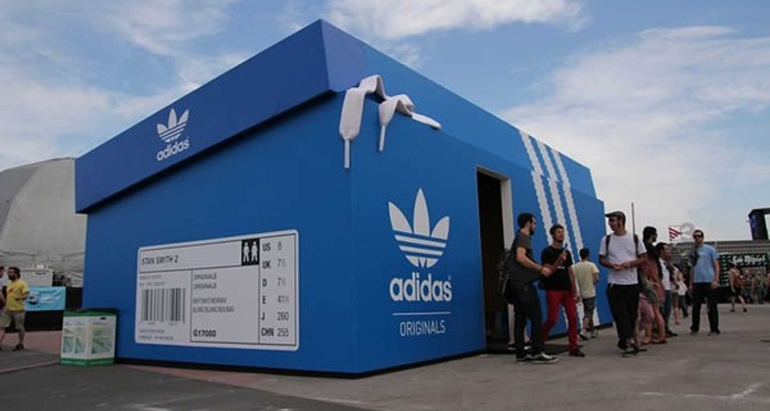
Since the social experience and the sensations experienced during the event are at the center of this type, the material aspect (architectural and structural) has a secondary importance compared to the emotional sphere. Widespread since 2000, today there are many types belonging to this category: temporary store, shop sharing, guerrilla store, pop-up store and wheel-shop. Each typology is distinguished by physical characteristics, duration, personnel and marketing strategy; for example, the temporary has a limited duration, the pop-up shop and the guerrilla store remain open until exhaustion of goods, while the shop-sharing and the wheel shop are short-lived, only for one day. Let’s briefly see what each consists of:
- Temporary store > store with limited and pre-established duration
- Shop sharing > store shared between brands and for a limited period of time
- Guerrilla store > new and unexpected store that arouses amazement in users
- Pop-up store > temporary store of limited edition products associated with an event
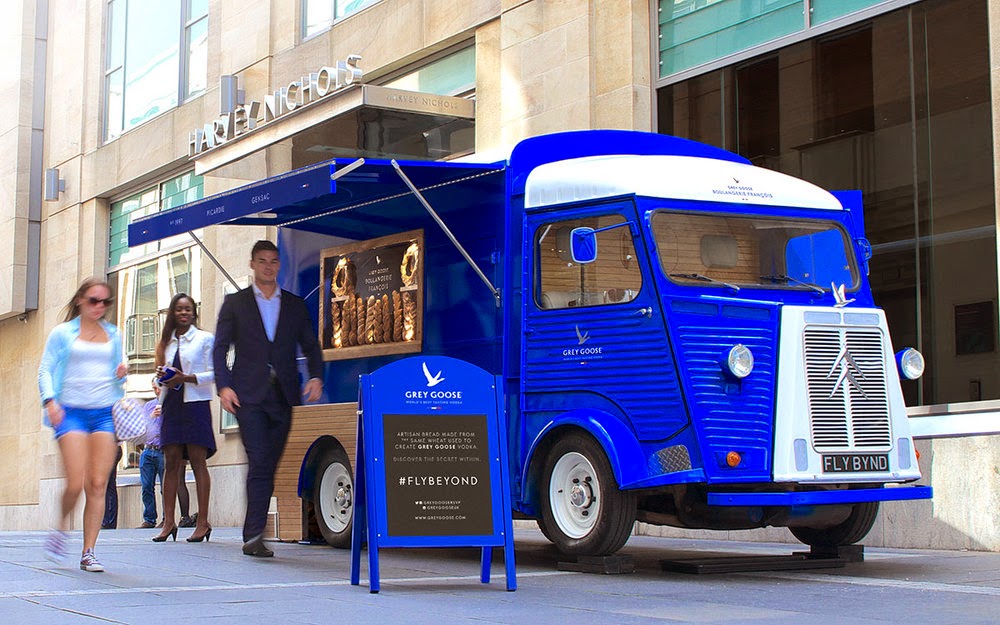
- Wheel shop > concept of a mobile store, not within a physical space with a short duration
Whether it is permanent or on the contrary temporary shops, during the preliminary phase of the project it is always necessary to carry out an accurate market analysis aimed at identifying the target audience and competitors present. Each typological decision must be decisive to ensure functionality in terms of usability of the spaces by the user, in compliance with the specific brand. Furthermore, the choice of the set-up and materials must reflect the corporate values and consequently those of the loyal customer. The design process of the store today no longer has the sole purpose of inducing the purchase through attractive fittings but must accompany the customer in a real experiential journey.
Smart retail: the stores of the future
The physical and conceptual development of the shop has led to numerous changes considered a direct mirror of an increasingly demanding and up-to-date user. From the ancient artisan shops where the set-up was almost completely neglected in favor of the production equipment, we went to a period in which the spectacularization of the goods found its founding value in the exhibition. Subsequently, the shop went through alternating phases in which more or less importance was given to the furnishing and display project of the products on sale, up to the present day when the customer experience needs attractive and engaging fittings. Since the twentieth century, innovative technologies have greatly changed the physical space of the stores which have had to compete more and more with the world of e-commerce.
The importance of the service provided to the customer at the expense of the product and its real quality is increasing. For this reason, if you once went physically to commercial spaces where you had direct contact with the product and observed the ad hoc set-ups, today and in the future the practice of online shopping will be increasingly widespread. This scenario marks the crisis of the material store. In the near future, the purchase will take place online while the old shop will perform the sole function of collecting the goods. Customer assistance today for shop assistants will be replaced by mechanical items capable of recommending the choice of products and clothes through information totems or multifunctional mirrors capable of modeling the outfit on the silhouette of the reflected person. The functional areas and the furnishings designed on them will be absent in favor of continuous and approved spaces where the cash desks will be absent because payment has already been made online.
You can witness phenomena of:
- Progressive dematerialization of the physical place
- Standardized construction and loss of design value
- Descending customization
- Fast and automatic purchase of goods
- Online and offline merger
If on the one hand advanced technology and progress facilitate and speed up the sales process, on the other hand they deprive it of important values such as human relationships, direct contact with the product and the ability to choose according to personal criteria. The risk is that of an excessive automation of human actions and an unconscious alienation caused by the uncontrollable vortex of the virtual world where design loses its most intrinsic value.
